Documentation for Heavy Machinery
Making safety-critical documentation fast to navigate, safe to follow, and impossible to get lost in.
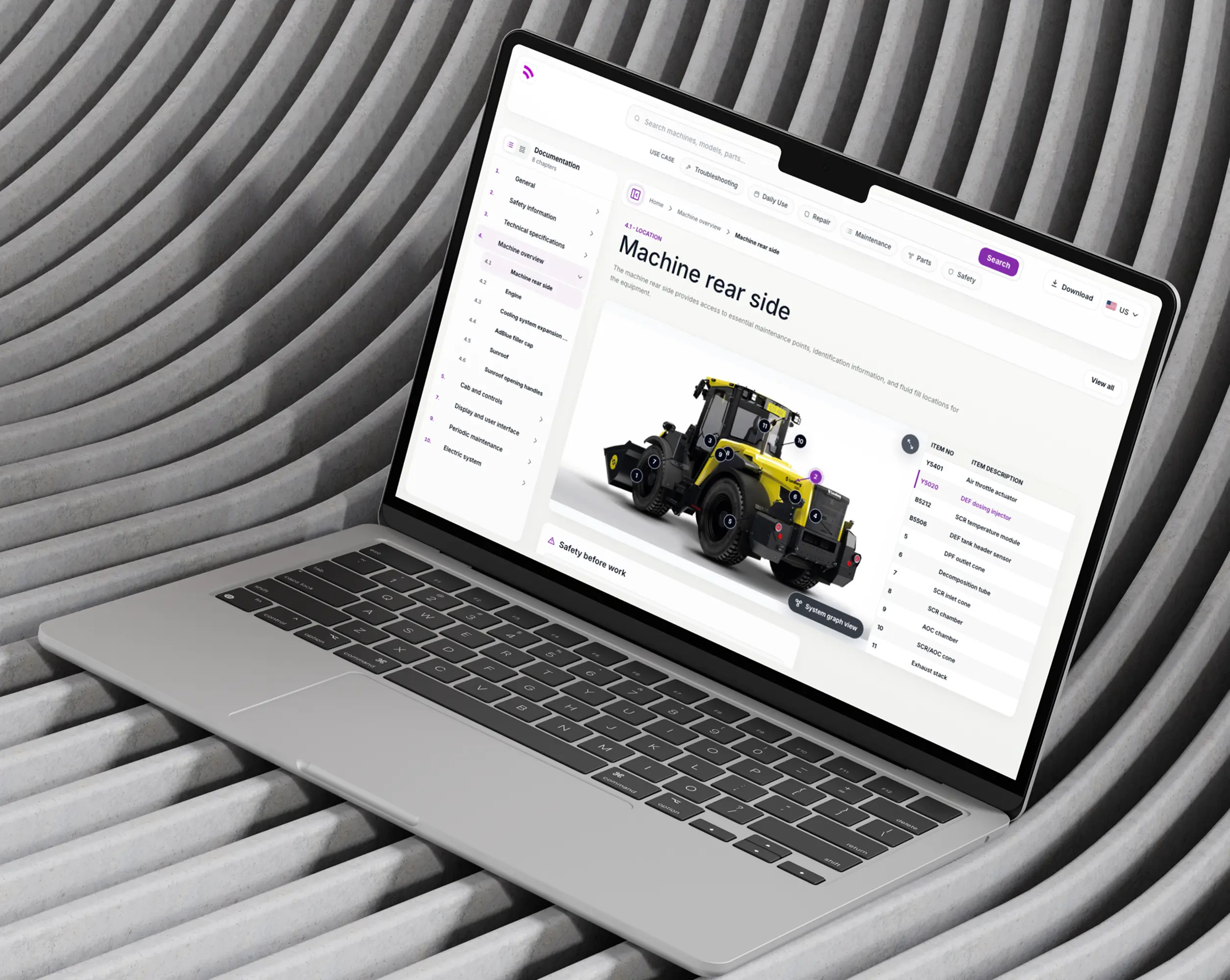
Documentation for Heavy Machinery
I redesigned a Documentation Viewer web page for Spogen.ai, a company that helps teams create, manage, and use product documentation more intelligently. The goal was to make heavy machinery documentation easier to search, understand, and use in high-pressure work environments where users need fast and safe answers.
My Role
Solo designer embedded in the Spogen.ai product team. I owned the full process, from contextual inquiry and competitive research through wireframes, two rounds of usability testing, and a second iteration that introduced new features informed by shadowing and systems thinking.

Outcome & Impact
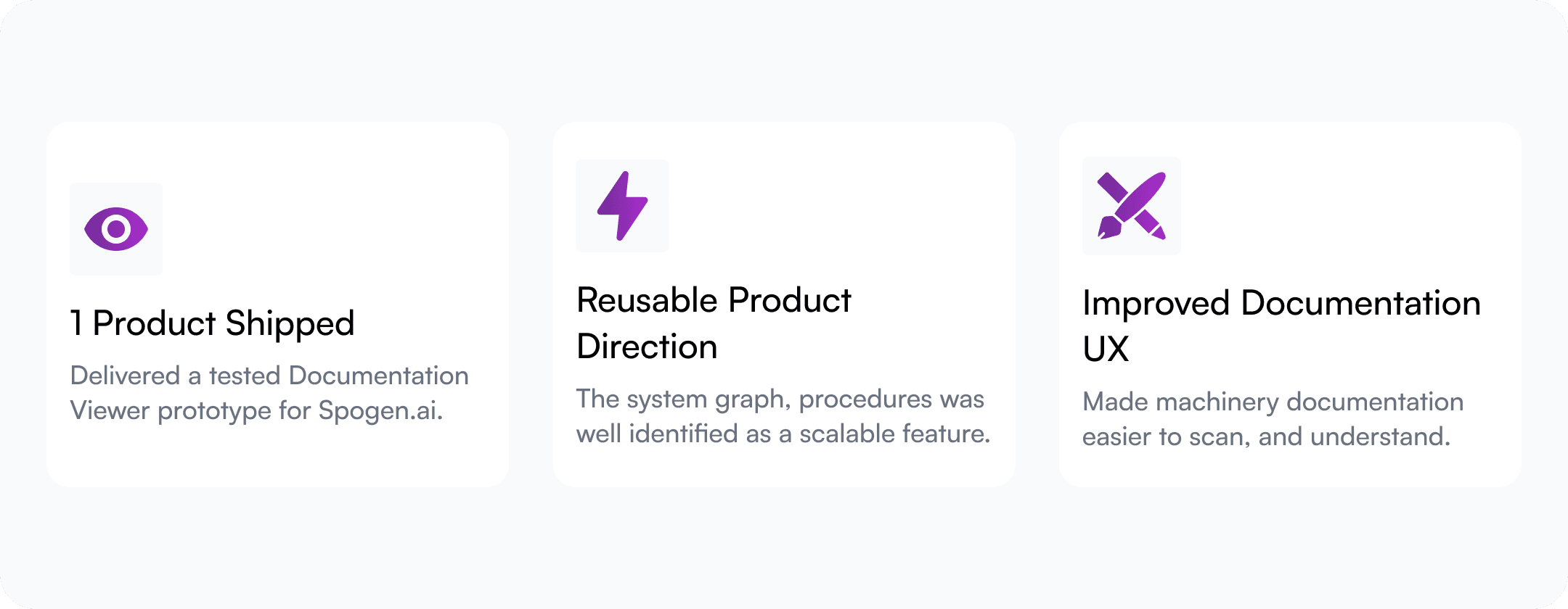
5 of 5 usability testing tasks passed successfully on the first round.
System Graph was identified by the CTO as valuable enough to extend to two other Spogen products: the AI Assistant and the Doc Builder.
Procedures called out as uniquely user-friendly by turning long manual content into clearer, task-based steps.
Role-based filters were removed after testing confirmed that use-case filters were clearer and faster.
Business Impact
The redesigned Documentation Viewer can help users find the right information faster, reduce support dependency, improve safety during maintenance tasks, and create reusable product value across the viewer, AI Assistant, and Documentation Builder platform.
The Problem
The existing HTML page rendered content, but it wasn't designed around how field work actually happens. The deeper problem: every user was treated the same. Operators need daily flow cards. Maintenance staff need checklists. Supervisors need compliance templates. The page reflected none of that.
Six structural failures defined the before state:
The Solution
I redesigned the Documentation Viewer into a task-focused experience where users can search, filter, scan, and explore documentation in different ways.
The solution includes use-case filters, list and gallery views, improved image callouts, a video library, breadcrumbs, collapsible navigation, procedure slides, and a system graph that shows how parts, systems, subsystems, and related content are connected.
Challenges
Some of the key challenges are rooted in the complexity of the hiring ecosystem itself.

Design Process
I began by understanding the current HTML page and the structure of the manual. I studied machinery documentation, explored similar products, and did contextual inquiry with an internal stakeholder who had worked on similar documentation workflows.
Then I identified key user needs for operators, technicians, maintenance teams, and supervisors. I created wireframes and solved one UX problem at a time, using Claude and Codex to support research, wireframing, and code prototyping.
After the first prototype, I tested the design with two internal stakeholders. Based on their feedback, I refined the navigation, filters, image callouts, and graph interactions.
In the second iteration, I also studied the Documentation Builder platform that generated the HTML page, and the AI Assistant experience. This helped me think beyond one viewer and design features that could be reused across products.


Identifying Design Principles
Before a single wireframe was drawn, four principles shaped every decision that followed.
Fast wayfinding
Find the right section quickly. Every feature reduces the number of steps between intent and content.
Safe, correct execution
Follow the steps without misinterpretation. Safety content is always surfaced, never buried.
Match the user's mental model
Operators, maintenance staff, and supervisors each think differently. The interface adapts to how they actually work, not how documentation is structured.
Progressive disclosure
Reveal complexity only when needed. Overview first, detail on demand, from the sidebar to the System Graph nodes.
Sketching & Iterating
After the first prototype, I tested the design with two internal stakeholders. Based on their feedback, I refined the navigation, filters, image callouts, and graph interactions.
In the second iteration, I also studied the Documentation Builder platform that generated the HTML page, and the AI Assistant experience. This helped me think beyond one viewer and design features that could be reused across products.
Design System
I used the Mobbin MCP plugin to study strong interface patterns and turn them into a reusable design system. This helped me define consistent components, spacing, typography, colors, cards, buttons, and interaction patterns, so the product could scale with a more polished and unified UI.

FINAL DESIGNS
Search with Semantic Chunking Filters Challenge
The challenge
Search results gave no context — title and chapter number only.
Design decision
Added semantic filter chips above results —
Troubleshooting
Daily Use
Repair
Maintenance
Parts
Safety
It is designed around one question: why are you opening the docs? Each chip maps to the most common reasons users come to documentation, not to content categories. Recent searches persist below the input, so context is never lost.
Why it matters
Users can narrow by intent before clicking. A maintenance technician looking for a procedure sees procedures, not every mention.

Home Page: List View + Gallery View
The challenge
Documentation for heavy machinery spans dozens of chapters and hundreds of sub-sections. A flat list creates cognitive overload; users scan endlessly without knowing where to stop. At the same time, users who remember content visually had no way to browse by image or layout context.
Design decision
Two switchable views serve two mental models. List view uses progressive disclosure, chapters collapsed by default, expanded on demand — so users see only what's relevant to their current task, not the full weight of the manual.
Gallery view organises pages within each chapter as a horizontal scroll, letting users quickly scan page thumbnails chapter by chapter without leaving the view.
Why it matters
Progressive disclosure in List view reduces cognitive load without hiding content — the structure is always visible, but the detail only appears when the user asks for it. Horizontal scroll in Gallery view turns chapter browsing into a spatial experience, matching how visual thinkers locate content by memory of layout and image.

Sidebar: List View + Gallery View
Persistent Breadcrumb
The challenge
No orientation cue in an 11-chapter scroll page. The sidebar state broke when chapters were collapsed.
Design decision
Persistent breadcrumb in the main content area, independent of sidebar state.
Why it matters
Works as a location anchor regardless of how the user arrived — search, deep link, or scroll.
Sidebar: List View + Gallery View
The challenge
The original sidebar had no persistent active state when a chapter was collapsed. A flat text list also forced all users into the same navigation model, even those who locate content visually by image and layout.
Design decision
Two switchable sidebar view modes, inspired by the Google Chrome PDF viewer. List view uses a text-based table of contents with both the parent chapter and active sub-chapter highlighted simultaneously, whether the chapter is expanded or collapsed.
Gallery view replaces text titles with image thumbnails labelled by section number, letting users scan pages visually within a chapter. The active state persists in both modes.
Why it matters
Highlighting the chapter and sub-chapter together, even when the chapter is collapsed, eliminates the "I'm lost" reading. The two modes serve two mental models without conflict: users who navigate by structure use the list, users who navigate by memory of image use the gallery. Both always show where you are.

Image Callout Side Panel
The challenge
Detail cards covered the image they were annotating. No way to compare callouts or see the full system.
Design decision
Moved callout details to a structured side panel — item number and description in a table, with zoom controls and a link to the System Graph.
Why it matters
Users hold the full image in view while reading callout details. Scanning and comparison become natural.

System Graph
The challenge
Users think about machine systems and how parts connect, not about chapters. No tool existed to explore those relationships.
Design decision
Interactive node diagram with progressive disclosure. Simple system overview by default; click a node to reveal description, connected subsystems, and related videos. Bottom controls for zoom, expand, collapse, and reset.
Why it matters
Matches how technicians and engineers actually think about machinery. CTO identified it as valuable enough to extend to the AI Assistant and Doc Builder platforms.

Procedure Slideshow
The challenge
Where to place navigation arrows — bottom or side — when procedural steps can be long and require vertical scroll.
Design decision
Side arrows, not bottom. Bottom arrows compete with scroll; side arrows sit outside the content flow.
Why it matters
Users can scroll a long step fully before advancing, without arrow placement creating confusion about whether to scroll or tap next.

Learnings
Role-based filters don't work when roles overlap. I designed filters for both roles and use cases, then tested both. Role names confused users — categories overlapped, and people weren't sure which applied to them. I removed role-based filters entirely. Use cases were clearer and faster.
Shadowing changes what you design. Reading about users and watching them work are different inputs. The System Graph came entirely from watching an internal stakeholder navigate — not from any assumption made during the research phase.
Solve one problem at a time. Wireframing each UX failure discretely, rather than redesigning the full page at once, kept decisions traceable and made testing results easier to interpret.

Key Design Decisions
The biggest design direction was to move from a document-based experience to a system-based experience.
Instead of treating the manual as isolated chapters, I used a systems thinking approach. Heavy machinery users often think in terms of connected parts, systems, and tasks. The new System Graph supports this mental model by showing how systems, subsystems, procedures, images, and related videos connect.
I also used progressive disclosure to reduce cognitive load. Users first see a simple overview. When they click a node, they can open details, view connected subsystems, and find related videos.