AI Powered Student Admission Management
Designing intuitive AI-powered student admission management software for the YAC-Global Startup.
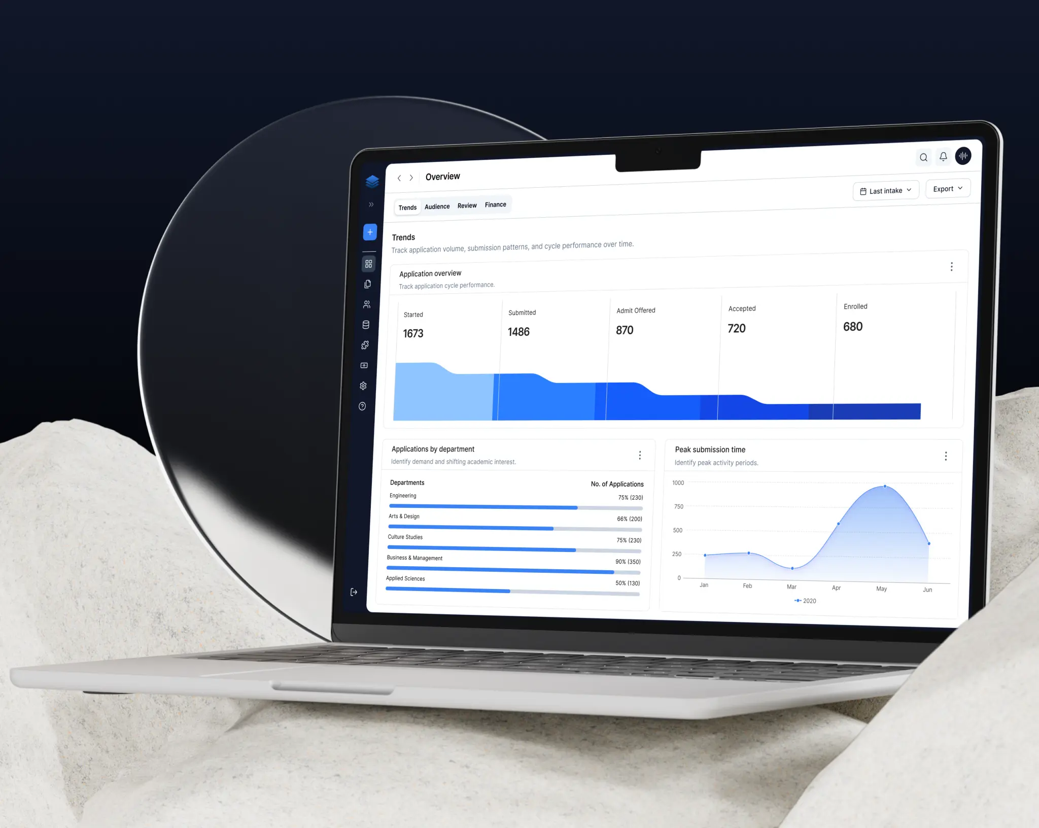
AI Powered Student Admission Management
Universities managing overseas admissions rely on multiple tools, spreadsheets, and manual processes to handle large volumes of student applications. This challenge spurred our team at YAC-Global to create Quest Apply—a super app for university admissions that brings applications, evaluations, insights, and workflows into one unified platform.
My Role
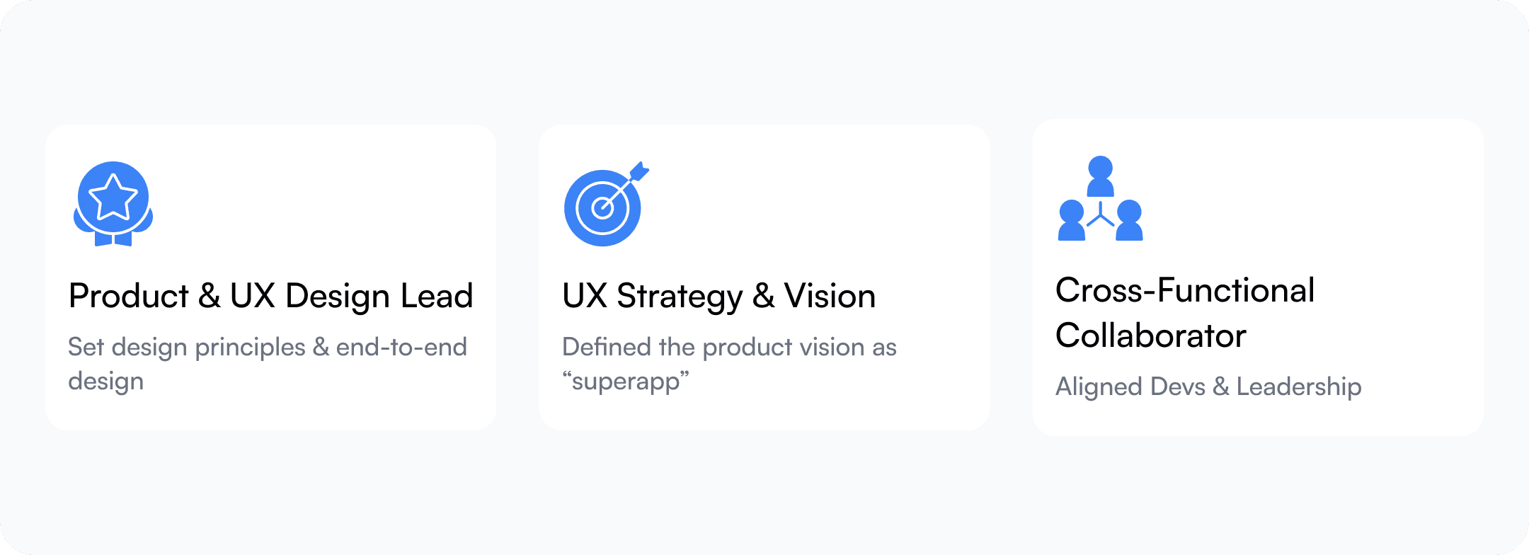
At YAC-Global, I set out to fix this. The product was called Quest Apply, an AI-powered admissions platform. I joined as the founding product designer with two months, one founder, and a blank Figma canvas.
This was the second product of YAC Global, and I worked as the founding Product Designer.
Outcome & Impact
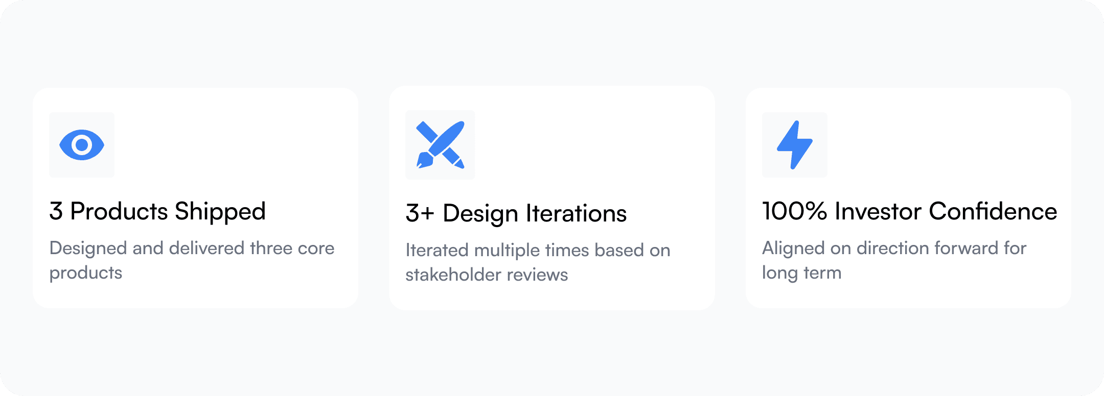
The platform established a unified admissions workflow that connected application management, applicant evaluation, and institutional reporting into a single system. The project demonstrated how AI could support admissions teams by reducing operational complexity while preserving human decision-making.
The Problem: Before — A Broken Process Hidden in Spreadsheets
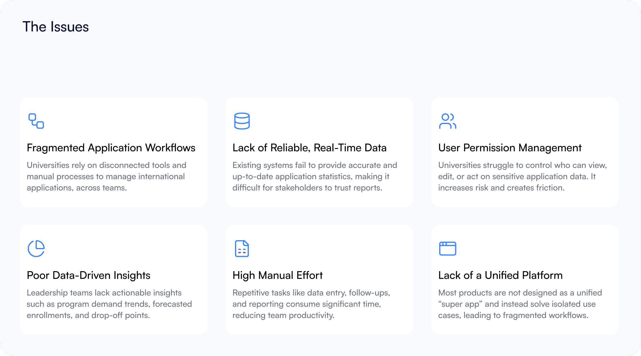
Universities recruiting international students and routing applications from developing markets to institutions in developed countries were stitching together a mess of disconnected tools. Spreadsheets for tracking. Separate systems for document review. Manual merit ranking. No unified data. No single place where an admissions team could see the full picture.
The Solution: After — One Platform, Every Stakeholder
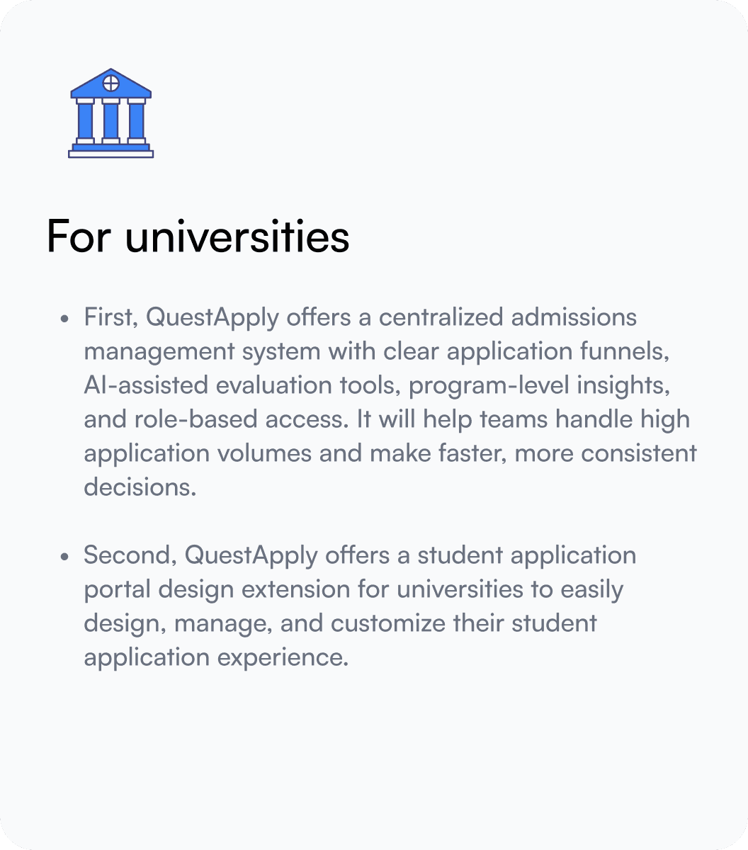
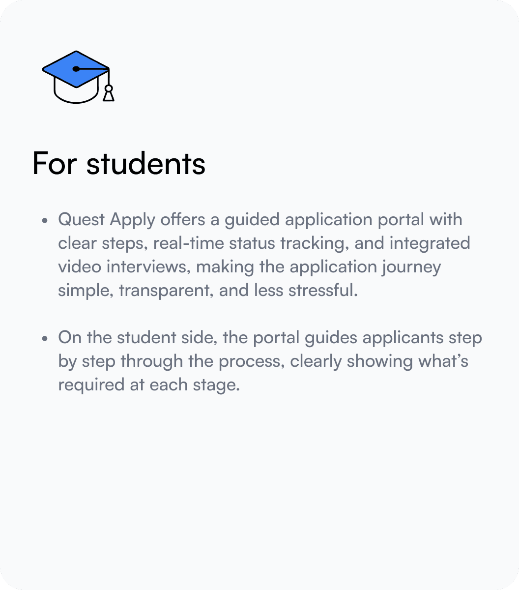
Quest Apply is an AI-powered student admission management platform that helps universities review and manage applications more efficiently.
The solution offers two connected experiences:
Challenges
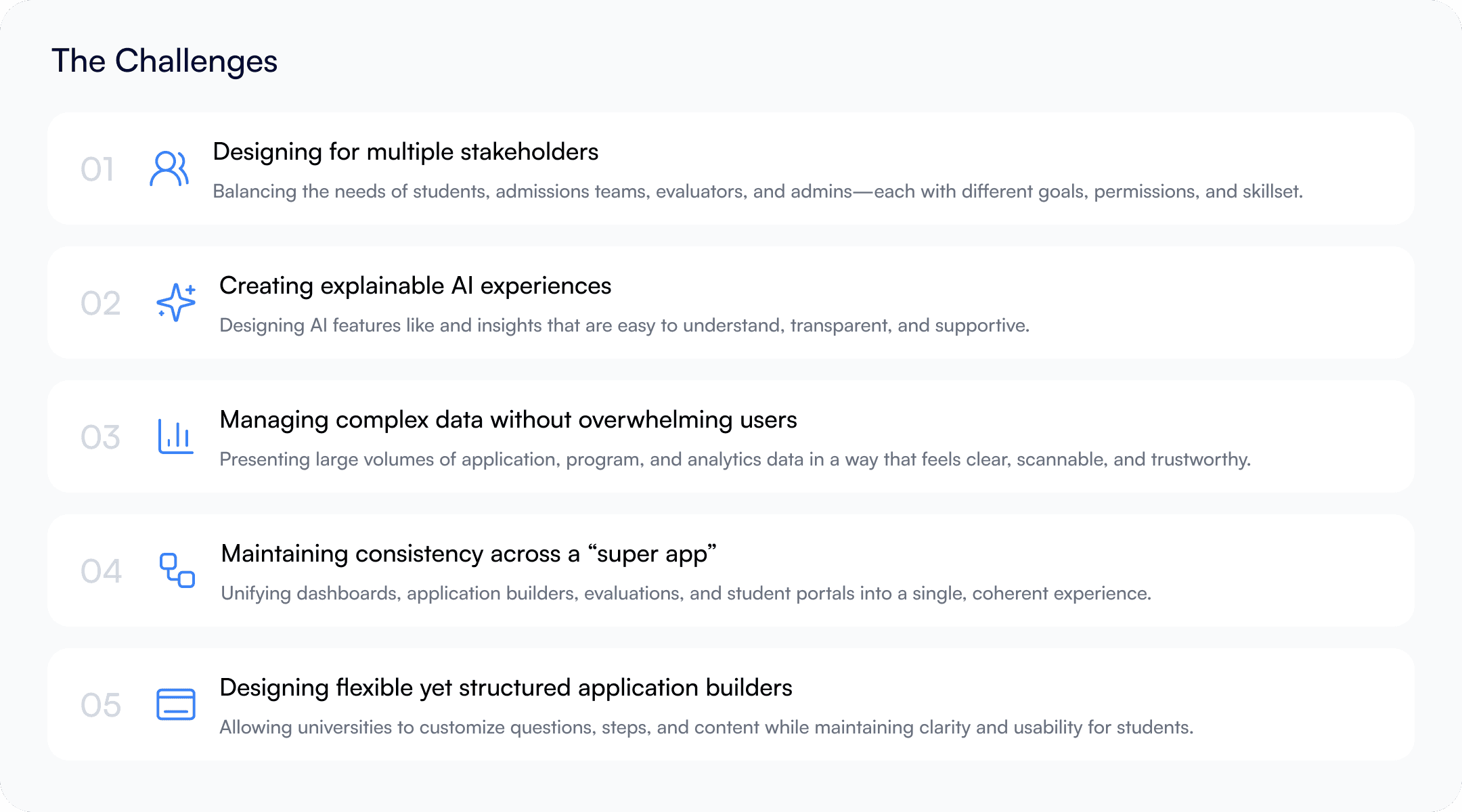
I conducted 6 stakeholder interviews across 3 roles, admissions officers, program coordinators, and applicant counselors, in the first two weeks. The problems crystallized into six clusters:
Design Process
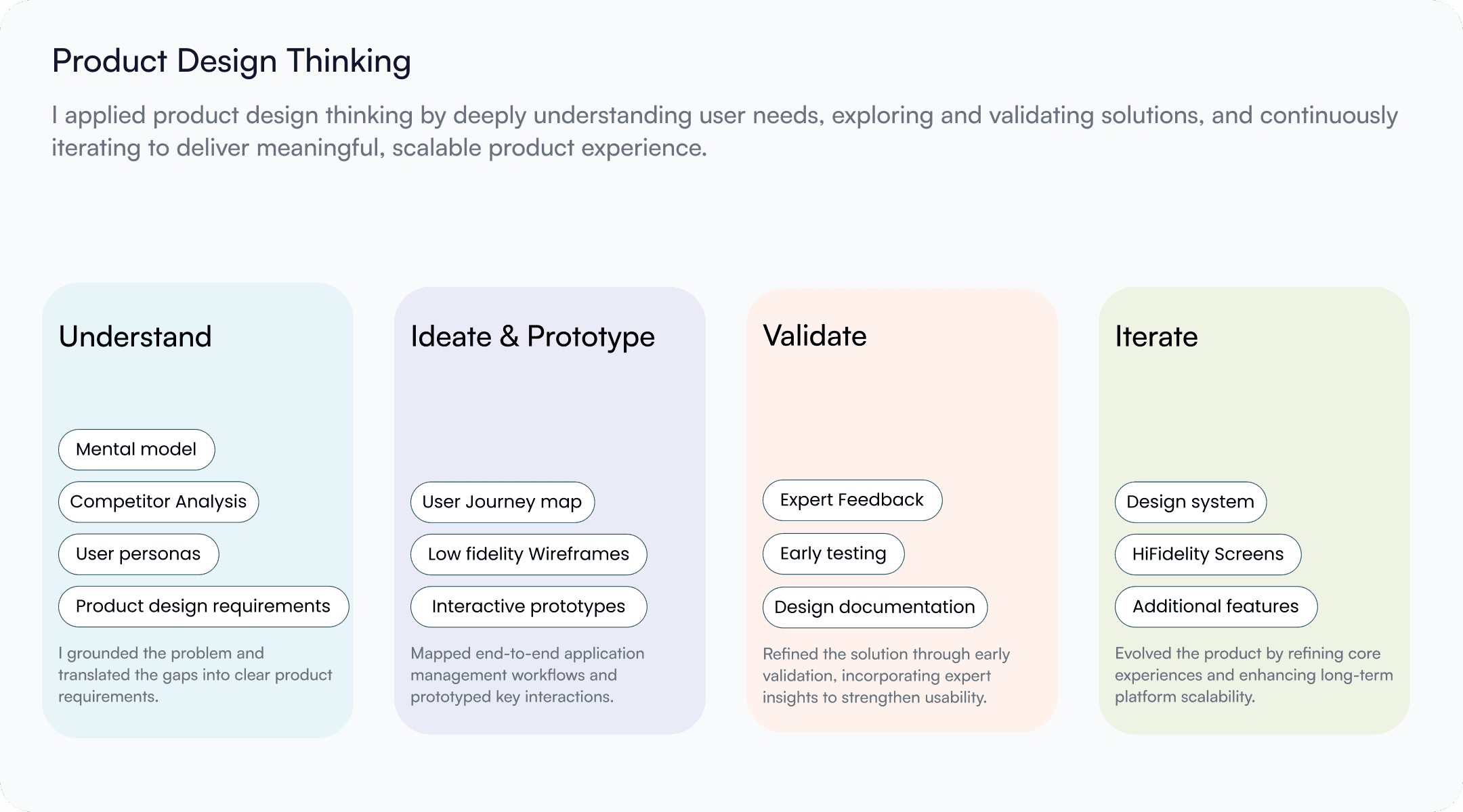
Stakeholder mapping + problem framing (week 1)
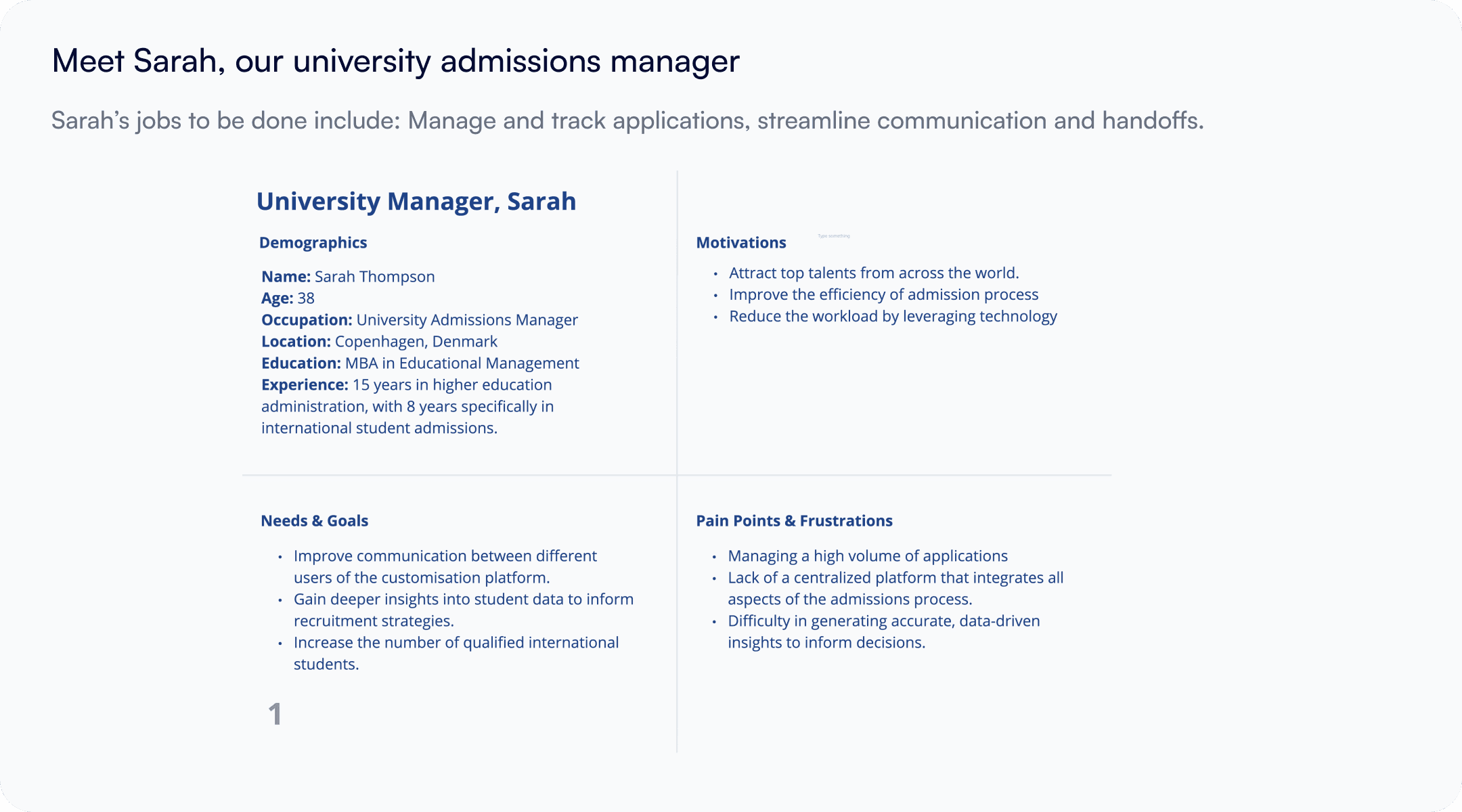
6 interviews. I mapped user roles and identified that the admissions officer was the most underserved; they held the most cognitive load but had the worst tools.
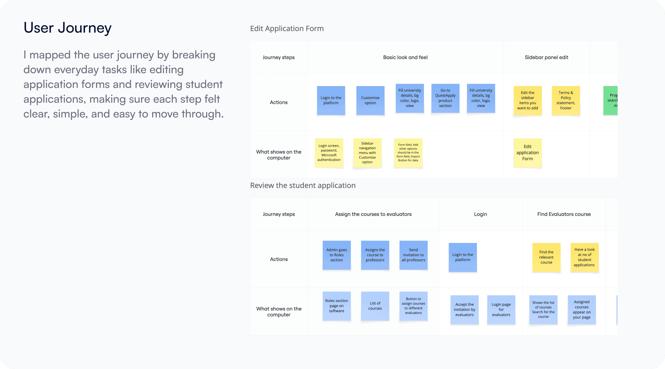
Flow mapping — two parallel journeys (week 1–2)
I mapped both the university side (review, evaluate, decide) and the student side (apply, track, respond). The key insight: these two flows needed to be designed as one connected system, not two separate products.
Concept testing with low-fi (week 2–3)
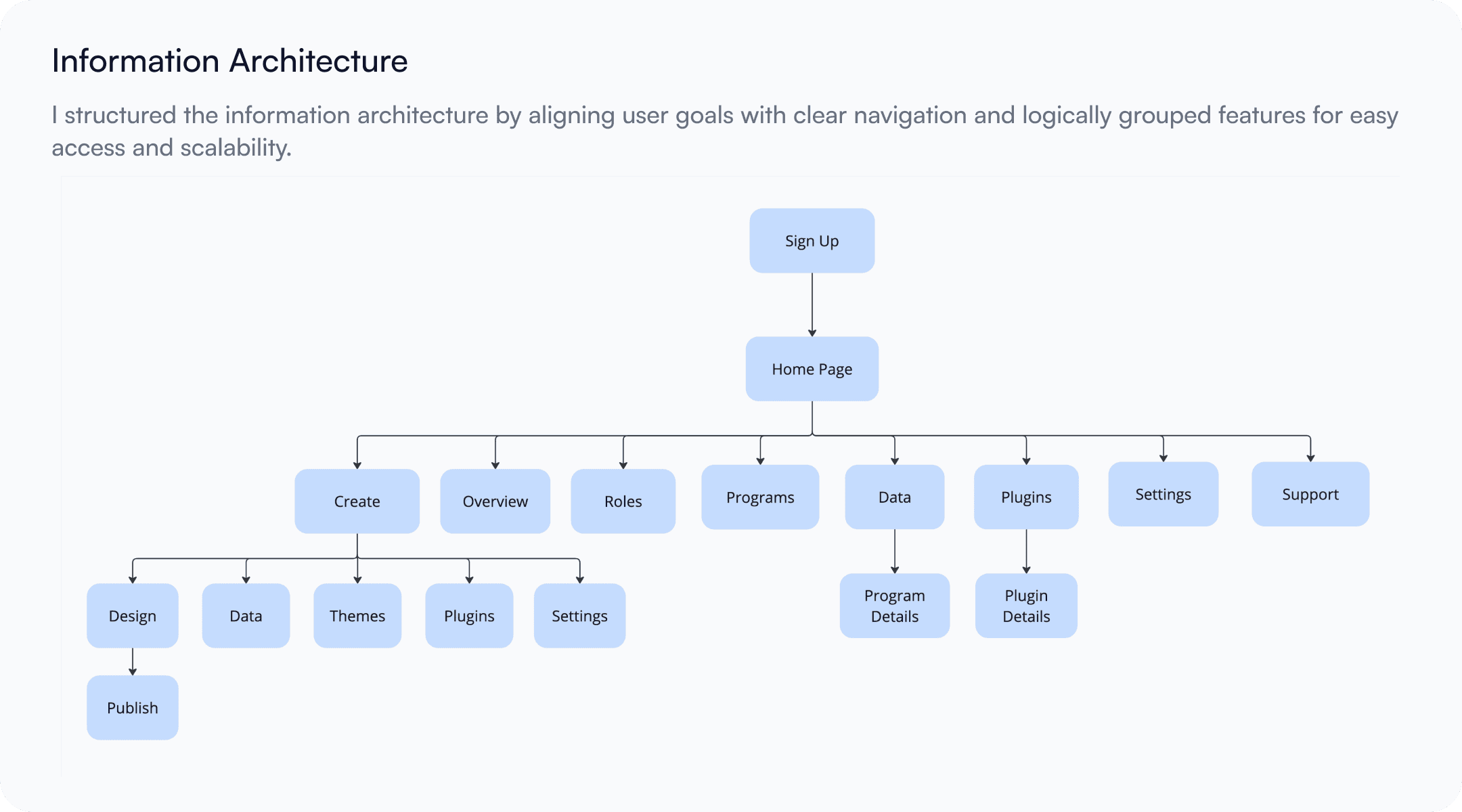
I sketched 3 competing information architectures in Balsamiq. The key debate: should the AI score provide final decisions?
High-fidelity + usability testing (week 4–6)
3 rounds of testing on the review flow. Changed the application pipeline layout twice based on feedback.
Identifying Design Principles
We identified four principles that guided every design decision.
1. Reduce operational complexity
Admissions teams should never need multiple tools to evaluate one applicant.
2. Surface actionable insights
Data should help teams make decisions, not create more analysis work.
3. Support high-volume review
The interface should scale from hundreds to thousands of applications.
4. Keep humans in control
AI should assist evaluation, not replace admissions decisions.
Sketching & Iterating
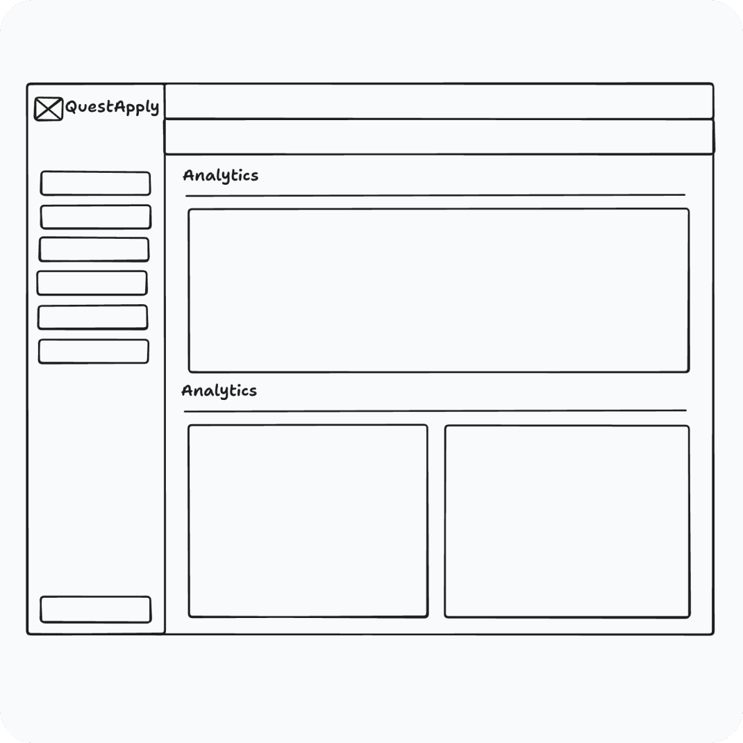
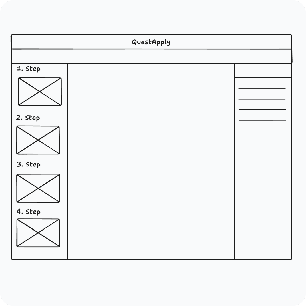
From early sketches to the final design, the process was iterative. I began by sketching out concepts based on key user needs and pain points, using these low-fidelity ideas to explore structure and flow quickly. Through continuous user research, stakeholder reviews, and hands-on feedback, I refined the designs across multiple iterations. This trial-and-error approach allowed us to validate ideas early and evolve solutions effectively.
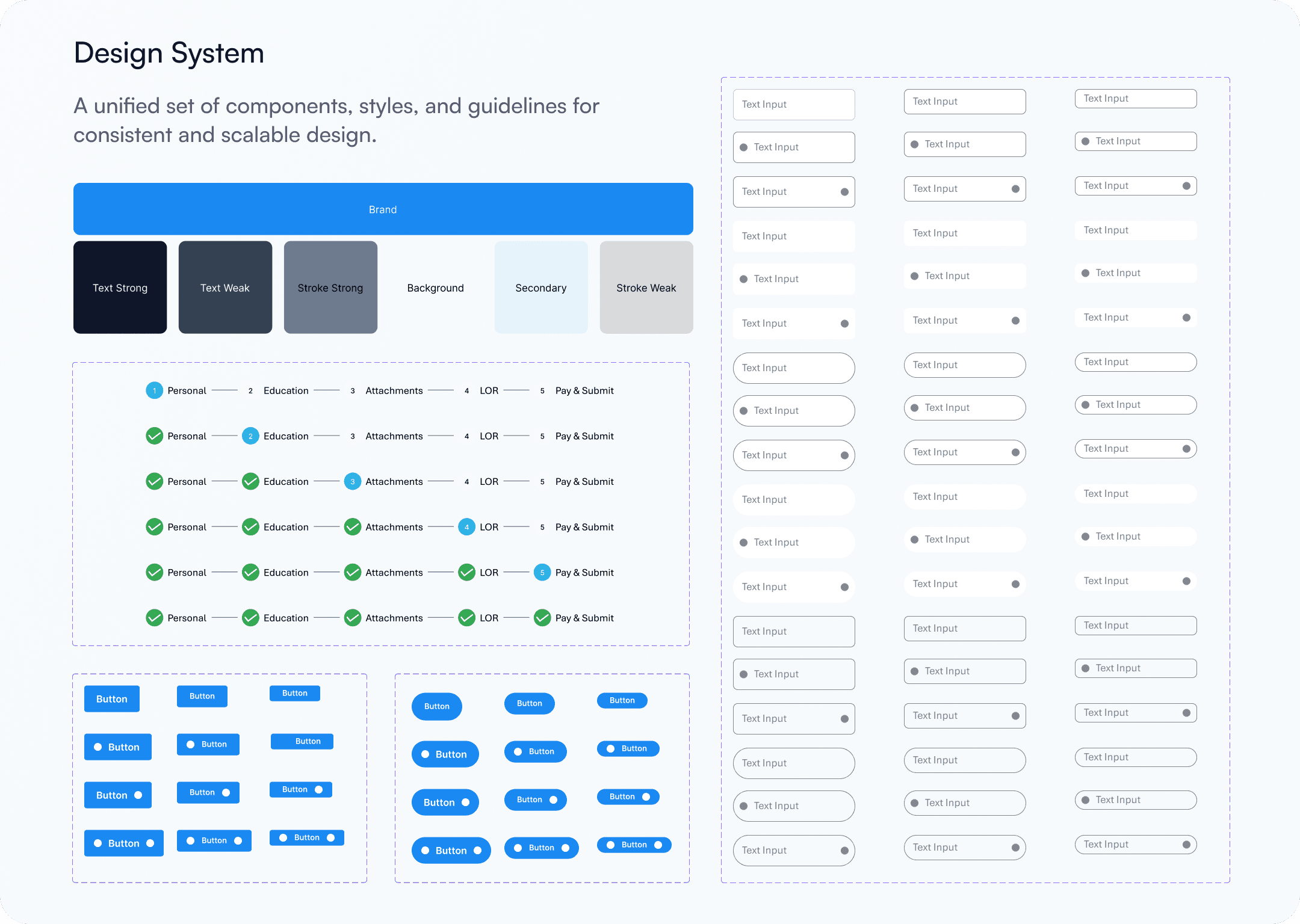
Design System
To ensure visual consistency, scalability, and efficient handoff to development, I built a modular design system tailored to QuestApply’s multi-stakeholder needs. The system included core components such as buttons, forms, cards, modals, tables, and navigation patterns—each designed with accessibility, responsiveness, and flexibility in mind.
FINAL DESIGNS
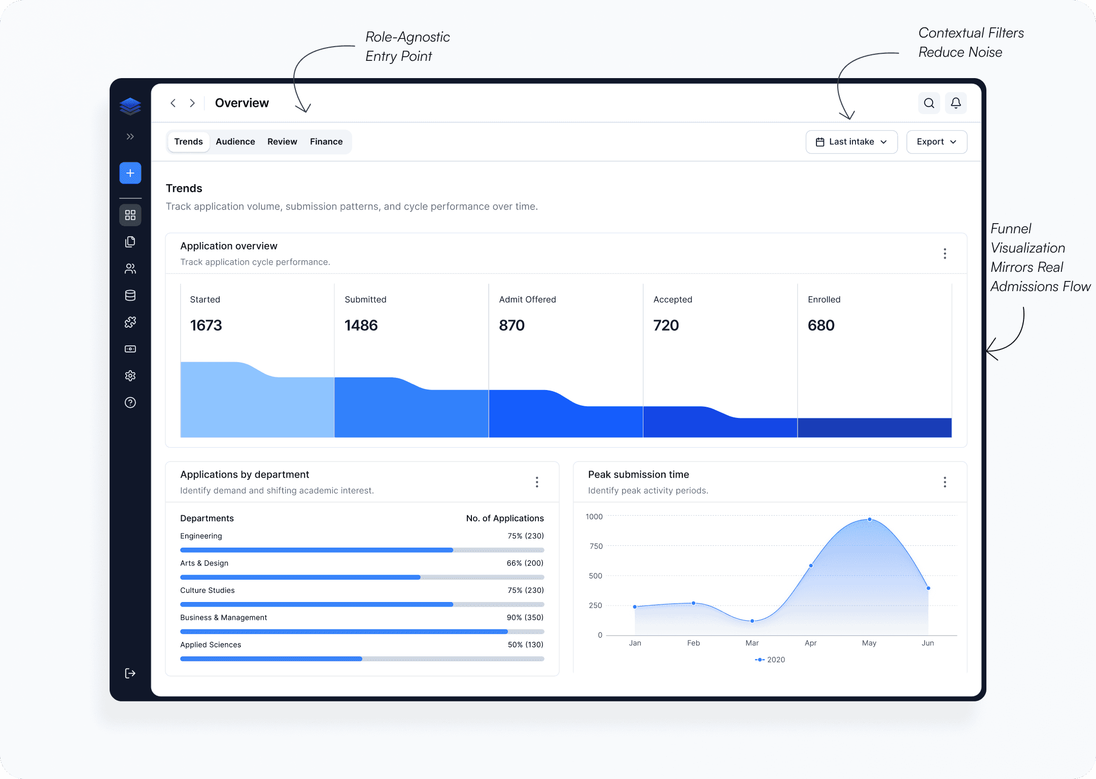
University Portal Overview
The Challenge
Admissions leaders needed to answer three questions immediately:
How many applications are in progress?
Which programs require attention?
Are admissions targets on track?
Existing workflows required pulling data from multiple reports.
Design Decision
Instead of exposing every metric upfront, I organized information into four layers. This allowed both quick scanning and deeper investigation.
Why It Works
Reduces cognitive overload
Prioritizes decision-making metrics
Creates a clear visual hierarchy
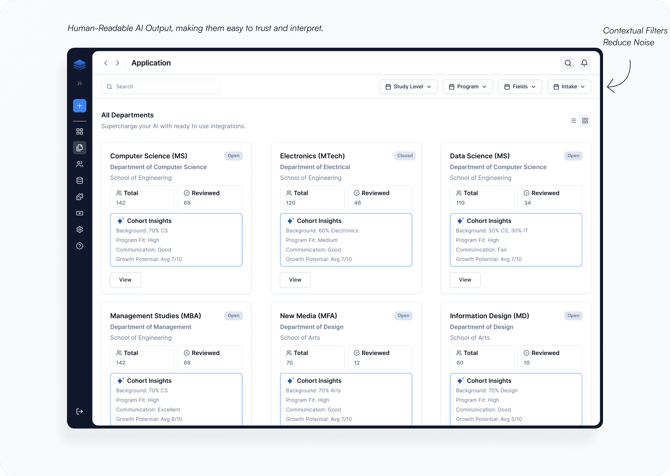
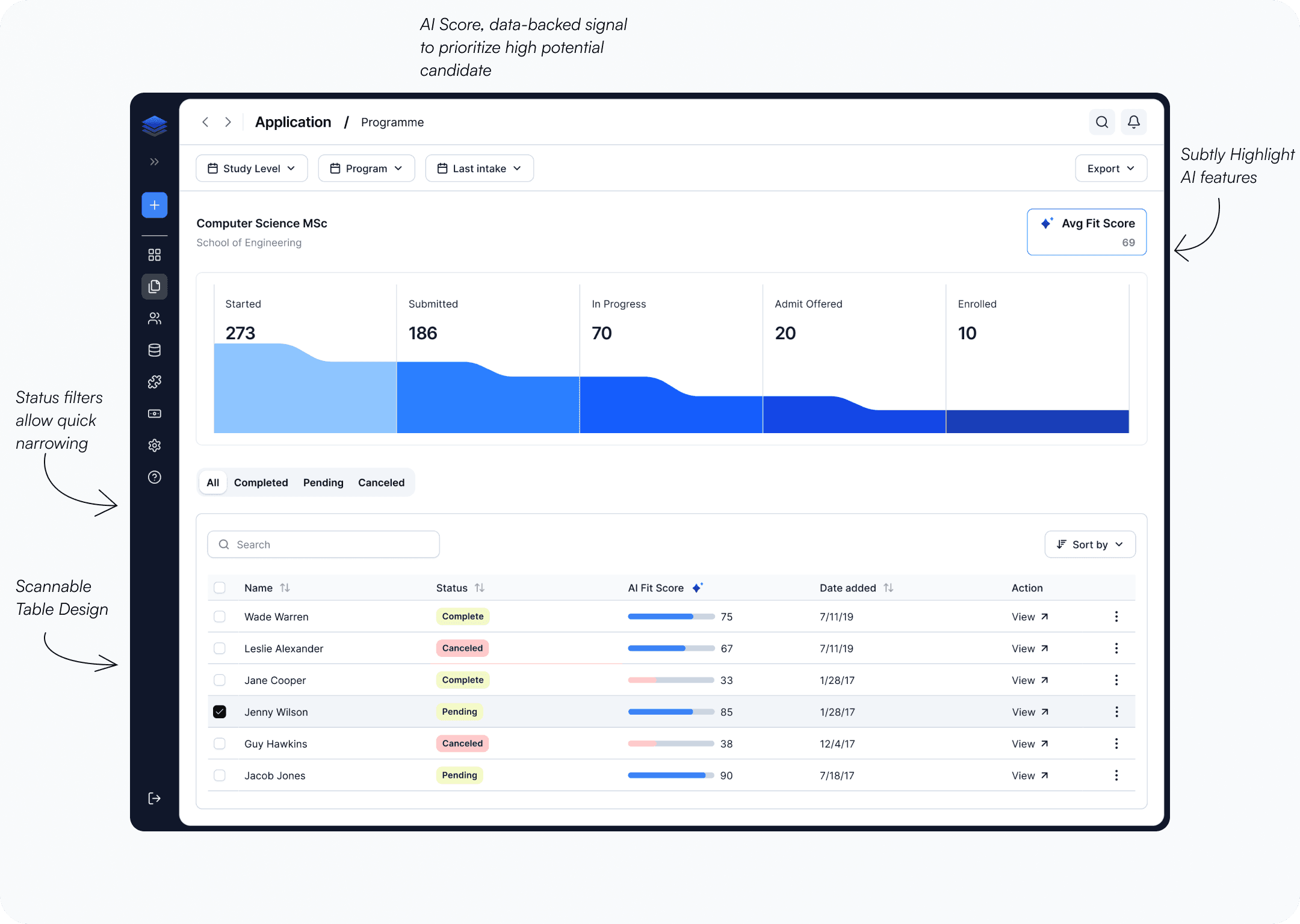
Program Level Application Insights
This screen provides a quick, program-level overview of applications across departments. AI-generated cohort insights reduce manual analysis and help institutions make faster, more informed decisions at scale.
Clarity Across the Application Pipeline
The Challenge
Admissions officers review hundreds of applications daily.
The biggest pain point wasn't reviewing applications—it was identifying which applications required attention first.
Design Decision
I designed the pipeline around workflow status rather than applicant data. This mirrors the mental model already used by admissions teams.
Applications move visually through:
Submitted → Review → Interview → Decision
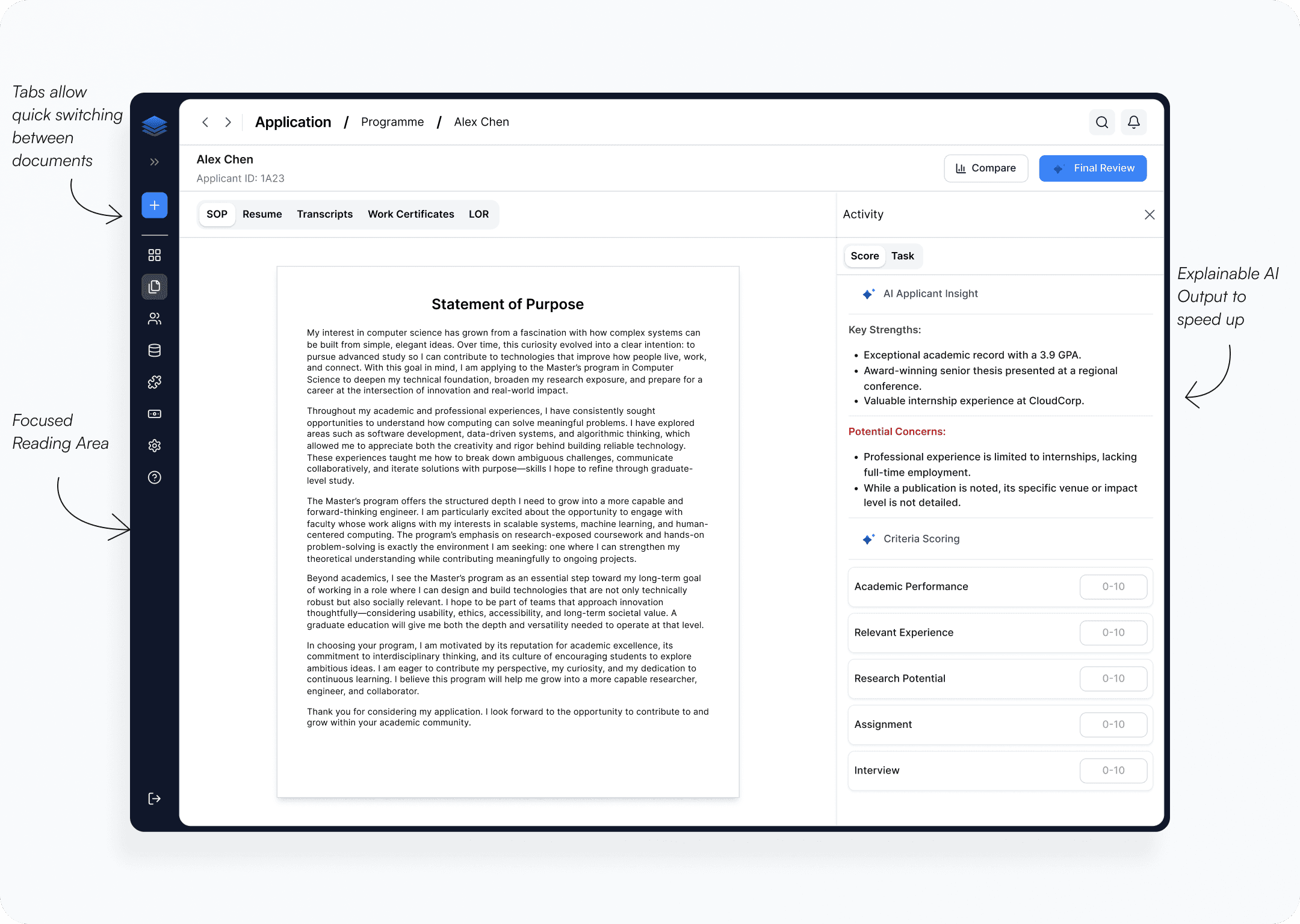
Reviewing an Applicant, Made Simple
Challenge
Reviewers constantly switched between:
transcripts
recommendation letters
test scores
notes
evaluation criteria
The context switching slowed decisions.
Design Decision
All applicant information was consolidated into a single review workspace.
The layout prioritizes:
Applicant summary
Supporting documents
Evaluation criteria
AI insights
Key UX Principle
Keep evidence and decision-making side by side.
Reviewers should never need to leave the screen to evaluate a candidate.
Result
The experience transforms application review from a document search task into a structured evaluation workflow.
Tradeoff
The screen supports rapid triage while preserving transparency.
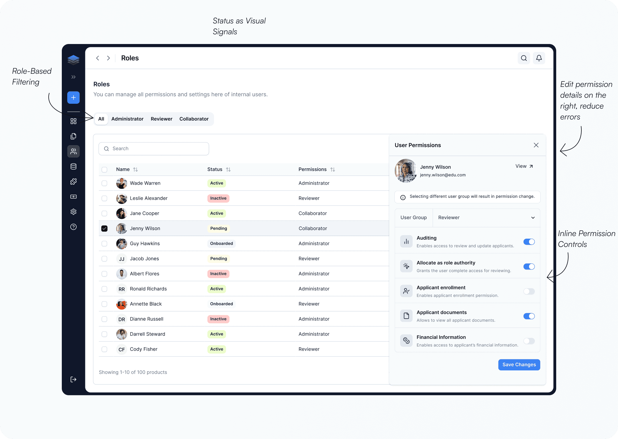
Simplified Role & Permission Management
Designing Role-Based Access Control
The Challenge
Different stakeholders needed different levels of access throughout the admissions journey.
Design Decision
I structured the platform around role-specific experiences, enabling administrators to define permissions for
Admissions officers
Counselors
Reviewers
University staff
Navigation, actions, and data visibility dynamically adapt based on the user's role.
Why It Works
The system reduces cognitive load, improves operational security, and ensures users can focus on completing their tasks without navigating unnecessary features.
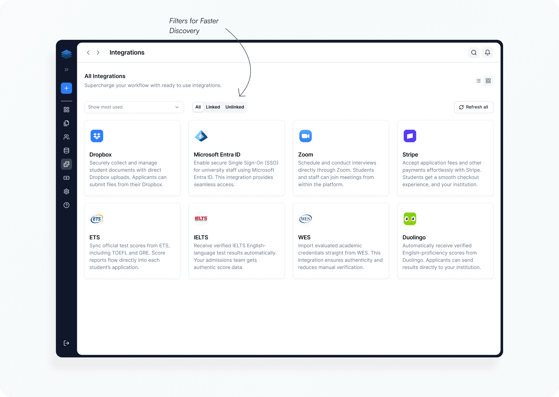
Extending the Platform Through Integrations
It transforms the platform into a true admissions super app by seamlessly connecting third-party tools that universities already rely on.
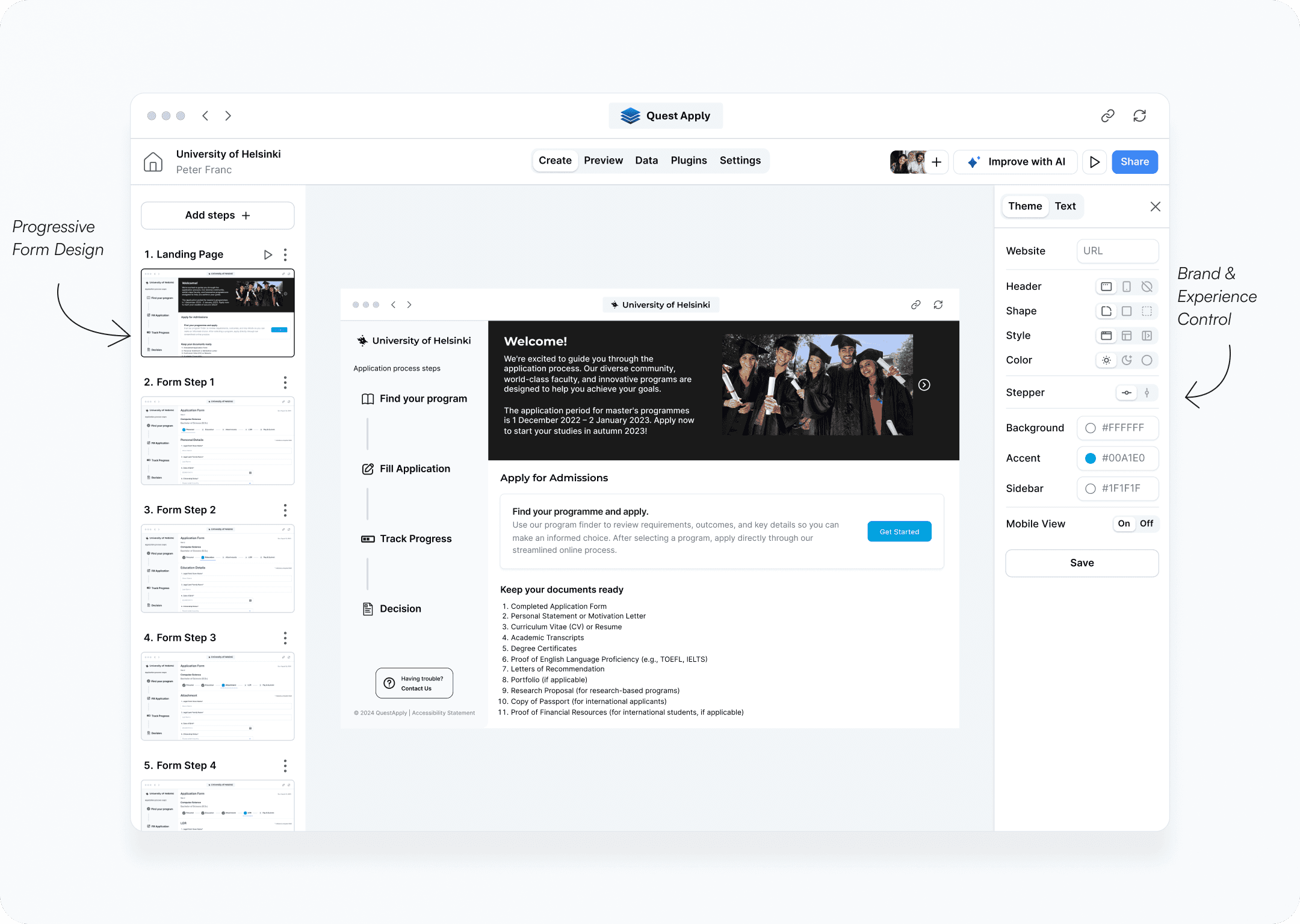
Create Student Application Portal
Why This Matters
Universities often have different admission requirements. Without flexibility, every change becomes an engineering request.
Design Decision
I created a configurable form-building experience that allows universities to:
add application steps
create custom questions
define required documents
adjust workflows
without developer involvement.
Why It Works
The platform becomes adaptable across institutions rather than being tied to one admissions model. This demonstrates product thinking and scalability.
Learnings
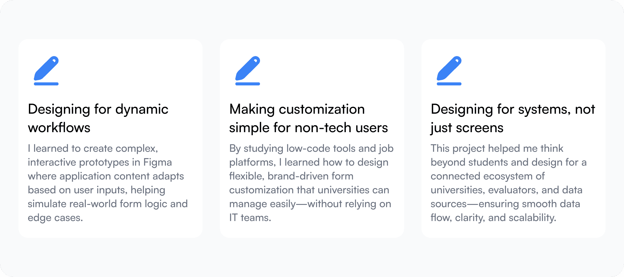
I learned that in complex B2B products, clarity often comes from how information flows across the platform rather than how a single interface looks.
My Reflections
Designing an end-to-end flow to develop a fully interactive prototype in a limited time was a significant accomplishment.
Handling such a big project, like creating an MVP for a startup to present to investors, was a real challenge. It required balancing tight deadlines, complex features, and the startup’s vision.
I joined YAC-Global as its first Product Designer in hopes of experiencing something new. Stepping into a blank slate gave me the freedom to explore, define, and build across all layers of the product experience. And it helped me grow tenfold as a fully faceted product designer. I can’t wait to take these new experiences and skills to my next role.