AI Study Abroad Counselling Platform
Designed a multiple-stakeholder platform for the YAC-Global startup to simplify the study abroad journey.
AI Study Abroad Counselling Platform
Students face difficulties in navigating the complex process of applying to universities abroad. Without personalized guidance, they risk confusion and missed opportunities. The goal of YAC-Global was to design Study Miles, a user-friendly platform that provides online counseling services and assists students in their pursuit of studying abroad.
My Role
As the founding and solo designer, I led the end-to-end design process.

Outcome & Impact
The design played a key role in shaping a clear and compelling product vision for Study Miles.

The Problem
Studying abroad is a 12–18 month process that involves choosing a country, short-listing universities, building a profile (grades, tests, essays, finances), submitting applications across different portals with different deadlines, tracking visa requirements, and staying in constant communication with a counselor throughout. Most students manage this across WhatsApp, spreadsheets, email threads, and the odd sticky note.
YAC-Global wanted to fix that. But the first thing you notice when you map the stakeholders is that this is not a single-user problem. It's three products sharing a database.

The Solution
Rather than a single problem statement, I mapped pain points by role, because each stakeholder group had a fundamentally different relationship with the chaos.


How Might We?
How Might We statements are most useful when they're specific enough to generate real ideas but not so narrow that they pre-solve the problem. Here are the ones that drove the most consequential design decisions.

Design Process
The Lean UX approach was adopted to bring a user-centered, iterative design process that aligns with YAC’s fast-paced development needs.
This process helped identify areas for improvement for Sprint 2 and iterate to meet high design standards before moving to the development phase.


Defining Product Design Principles
Design principles are only useful if they create constraints that force trade-offs. Here's what each principle actually ruled out.
User Centric Experience
Create an intuitive and engaging platform tailored to the needs of user groups.
Scalability
Design the platform to handle a growing number of users and data efficiently.
Trust and Credibility
Establish trust through transparent information and a professional design.
Empathy
Reflect commitment to supporting students through every step of their journey.
Personalization
Provide a tailored experience based on user profiles and preferences.
Sketching, Iterating and Wireframing
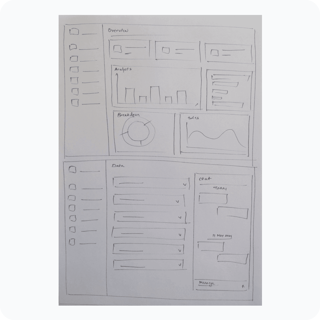
Before diving into high-fidelity design, I began with low-fidelity sketches and wireframes to explore layout ideas and interaction flows quickly. This phase helped clarify user journeys, define the platform’s core structure, and gain early stakeholder feedback without getting caught up in visual details.

Design System
Building three portals in parallel without a shared component library is how you end up with three products that feel like they came from different companies. I built the design system before the hi-fi screens, defining tokens for colour, typography, spacing, and interaction states, then composing portal-specific variants from those building blocks.

FINAL DESIGNS
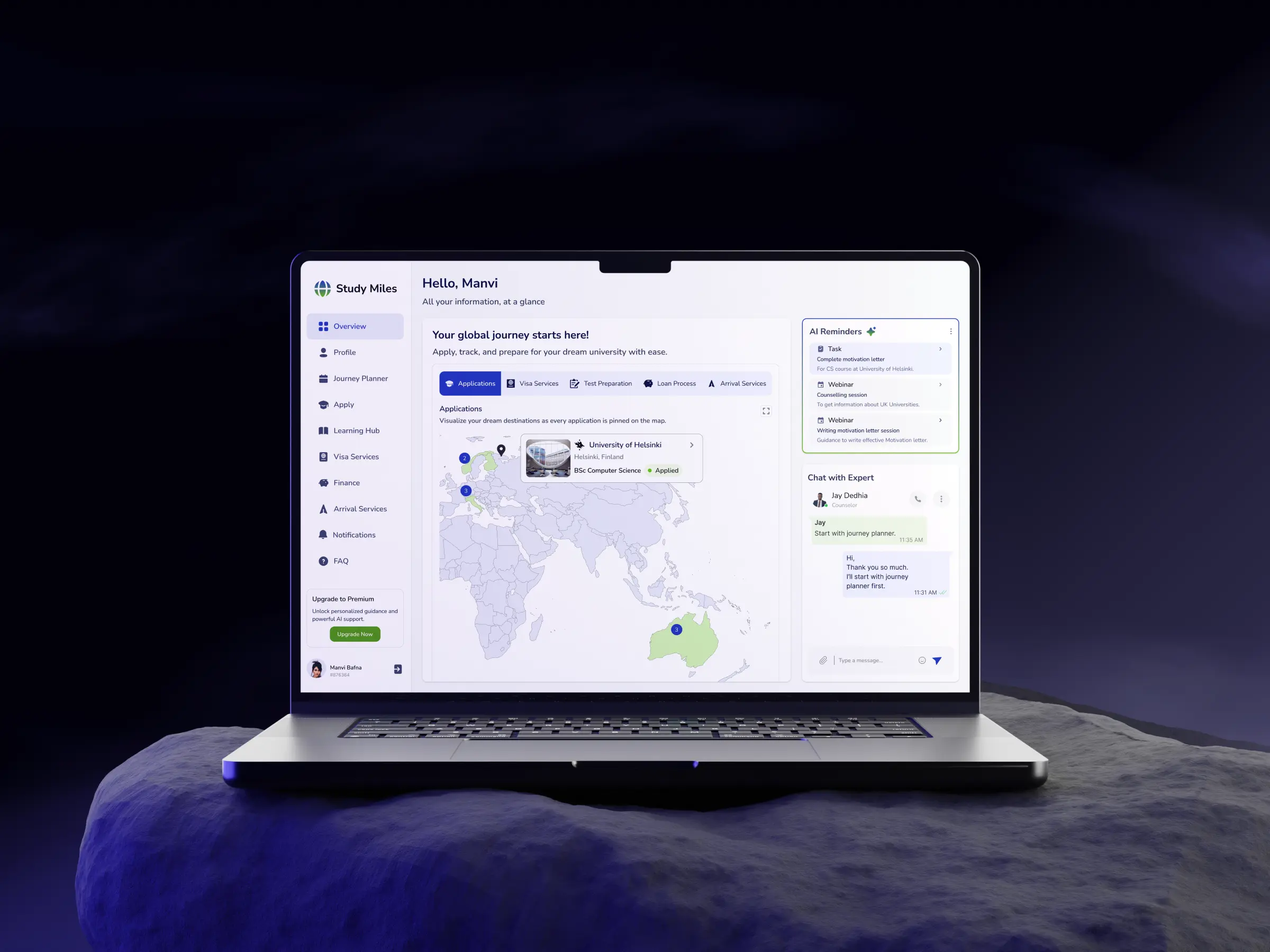
The Student Dashboard
The challenge
Students often lose clarity after onboarding, applications, tasks, and support tools are scattered, making it hard to understand progress or next steps in their journey.
Design decisions
The dashboard was designed as a single source of truth for the entire journey:
Map-based application overview to make progress spatial and tangible
Structured sections for Applications, Tasks, and Support
AI reminders surfaced as proactive next-step nudges
Embedded counselor chat for instant guidance without context switching
The focus was on unifying fragmented actions into one coherent view.
Why it matters
It reduces uncertainty in a high-stakes journey by making progress visible, actions obvious, and support always accessible—helping students stay engaged and move forward with confidence.

The Journey Planner
The challenge
Students needed a clear way to manage deadlines, tasks, and reminders without losing control.
Design decisions
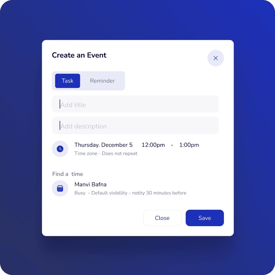
I used a calendar-first layout, a right-side task rail, color-coded task types, and an AI reminder toggle to keep the flow readable and flexible.
Why it matters
It turns a busy study-abroad timeline into a simple, proactive plan that reduces stress and makes next steps obvious.

The Student Applications
The challenge
Students needed one place to track every application without losing sight of status, deadlines, or who’s handling what.
Design decisions
I grouped applications by stage, made status highly visible, and used a table layout with search, sort, and quick actions to keep the list efficient.
Why it matters
It gives students a clear sense of progress and control, while making large application loads much easier to manage.

The Counselor Portal
The external counselor portal gives partner counselors a dedicated workspace to onboard students, track their progress across applications, and offer targeted guidance—all without needing access to the internal team's dashboard. Clean data tables and status indicators make it easy to manage large student cohorts at a glance.

The Enterprise Dashboard
The challenge
Leadership needs directional signals. Operations need actionable anomalies.
Design decisions
The KPI strip gives the C-suite their answer in 5 seconds; the tabbed analytics section gives ops their deeper drill; the donut and country list give finance their revenue read.
Why it matters
Leadership should be able to answer "are we growing?" in under 5 seconds without opening a report.

Enterprise Student Data
It was designed to help enterprise teams manage large volumes of students efficiently, without losing visibility into where each student is in their study-abroad journey.

Enterprise Student Detail & Activity
The challenge
Enterprise teams needed a complete view of each student without switching between profile data and communication history.
Design decisions
I split the screen into two clear zones: checklist-based student information on the left and activity threads on the right, with tabs for messages, to-dos, meetings, and team updates.
Why it matters
This keeps student progress and ongoing communication in one place, so counsellors can respond faster and stay aligned on every case.

Learnings
I learned how to design for multiple stakeholders within a single platform, balancing student simplicity with enterprise-level complexity.

Key Design Decisions
Multiple Stakeholders
To address the diverse needs of students, internal teams, and both internal and external counselors, we decided to implement a flexible, role-based platform architecture to cater to the diverse needs of each stakeholder group.
For students, the customer-facing platform prioritized clarity, guidance, and personalization.
To support internal counselors and team members, I designed an internal-use platform that provided visibility into platform usage, performance metrics, and student activity.
For external counselors who purchase access to the platform, I created a dedicated interface that allowed them to onboard students, monitor their progress, and offer targeted services.
AI personalisation is student-side only in v1
I deliberately scoped AI features to the student portal for launch. Introducing AI into counselor workflows without validating that the suggestions are trustworthy would erode the counselor's confidence in the platform.