In-Store AR Shopping App
Designing AR App to enhance in-store shopping experience.
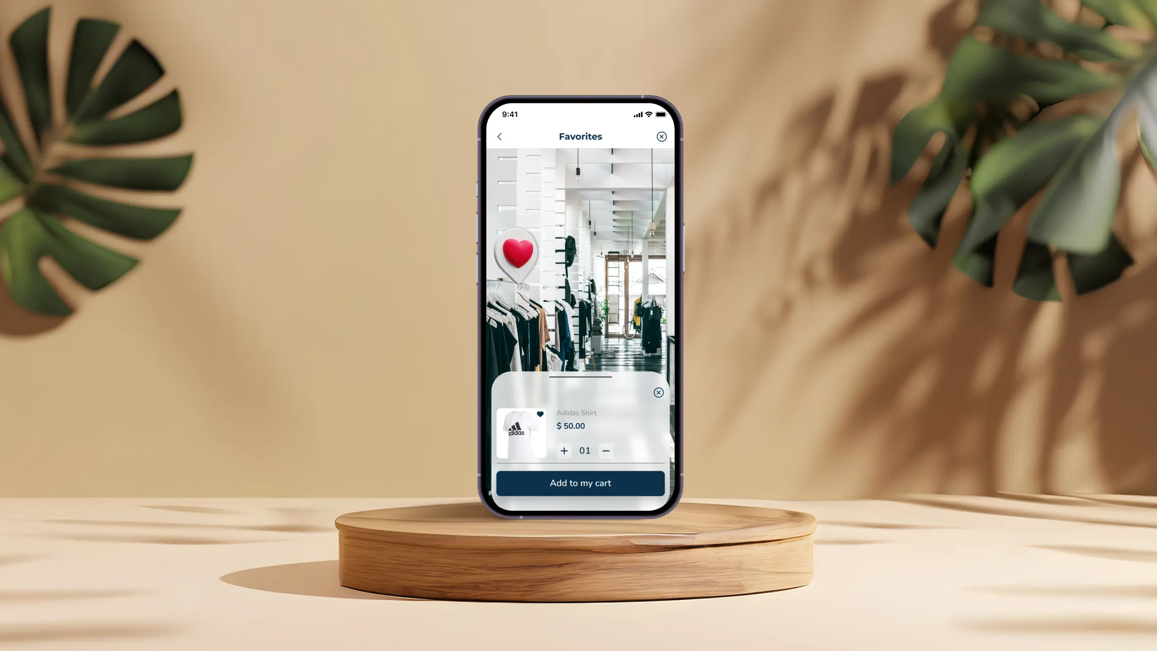
In-Store AR Shopping App
I designed an AR-assisted shopping app that enhances the in-store experience by allowing users to scan products, view specifications, and see real-time comparisons.
My Role
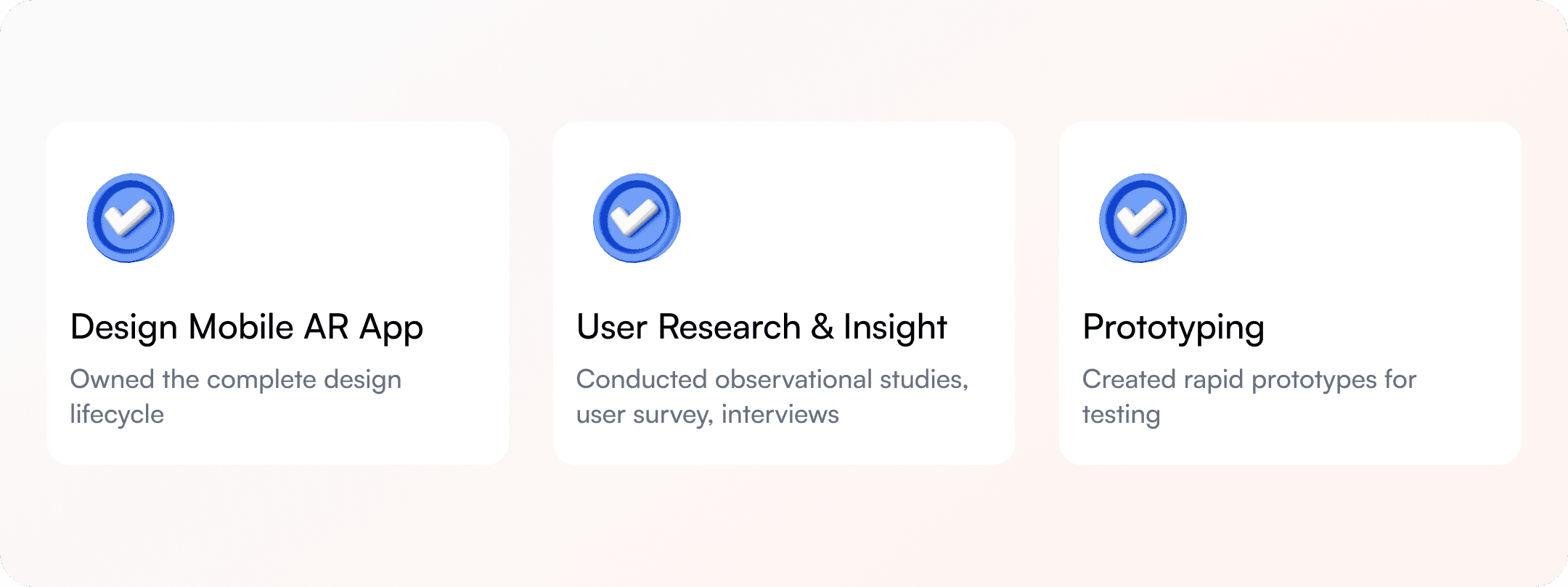
In this self-initiated project, I conducted user surveys, created personas and empathy maps, developed storyboards, organized content with card sorting, and designed lo-fi, mid-fi, and hi-fi prototypes for the app.
Outcome & Impact
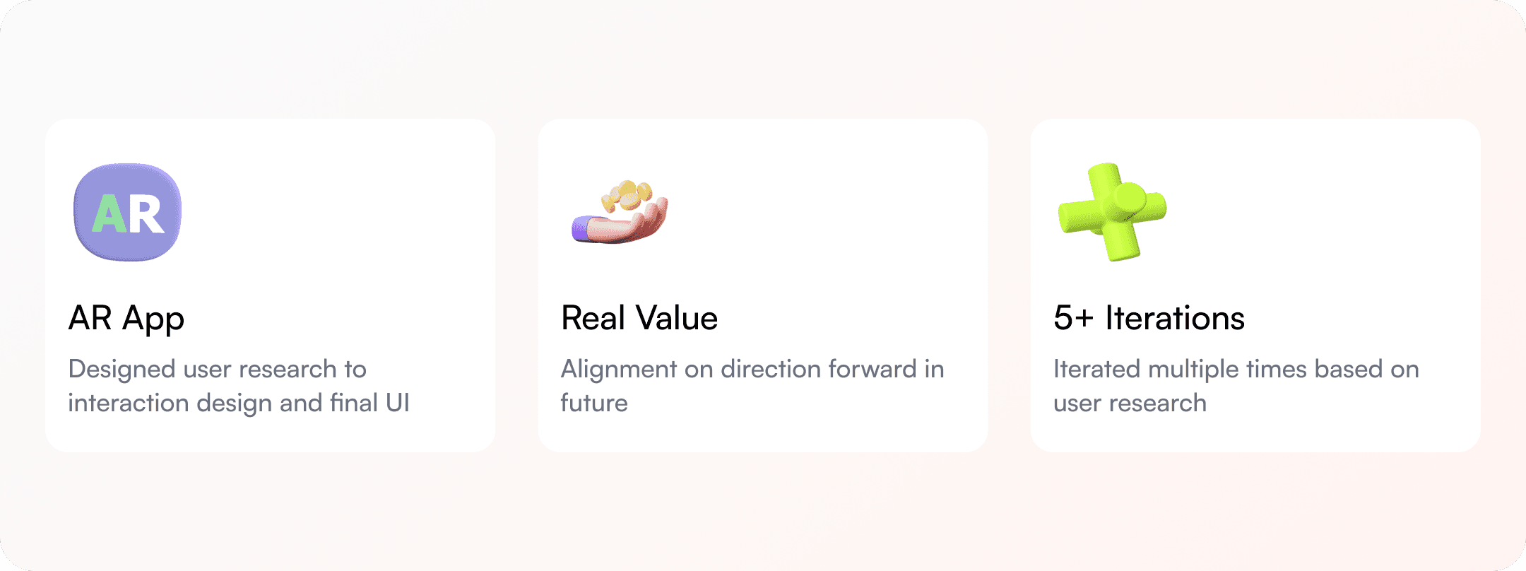
The solution demonstrates how AR can meaningfully improve offline shopping.
The Problem
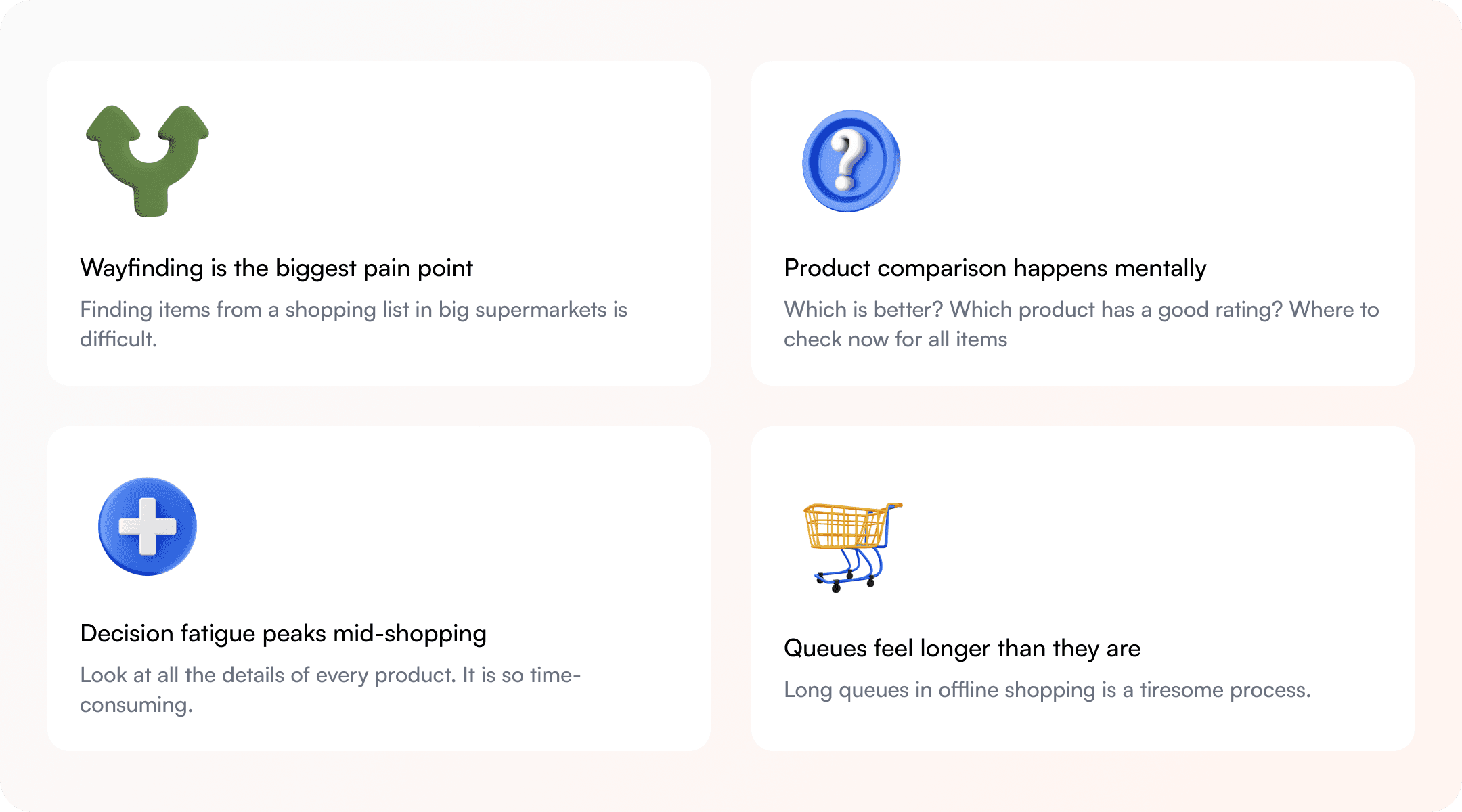
The idea came from a personal frustration, spending 40 minutes in a supermarket looking for a specific product, walking the same aisle twice, and eventually giving up. I started noticing other shoppers doing the same, checking phones, looking confused, abandoning carts.
I wanted to understand whether this was a widespread problem or just my own impatience. So I talked to people.
The Solution
Kart will assist customers in real time for navigation in supermarket. It will pop up short information, ratings, and reviews by customers on all different types of products with the help of augmented reality. Online payment using Kart will make offline shopping fun and less time-consuming.
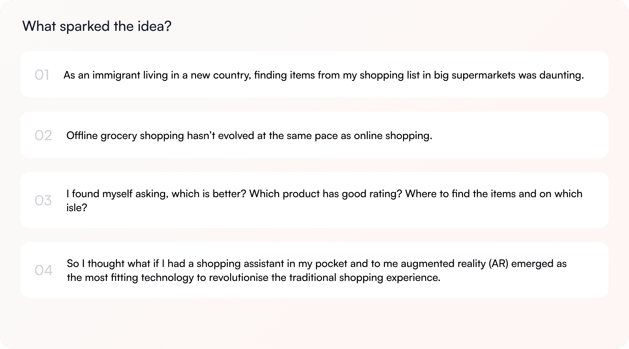
What sparked the idea?
The idea came from observing how inefficient and tiring offline shopping can be, especially in large supermarkets.
Design Process
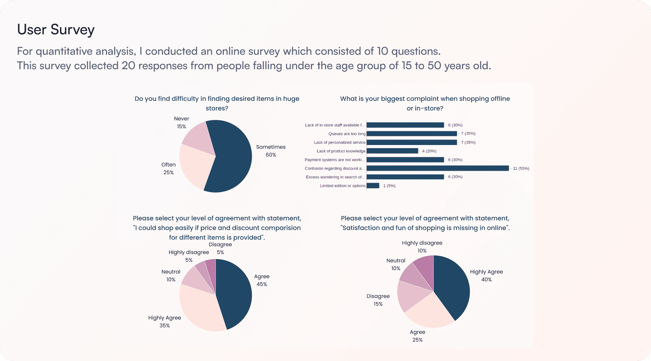
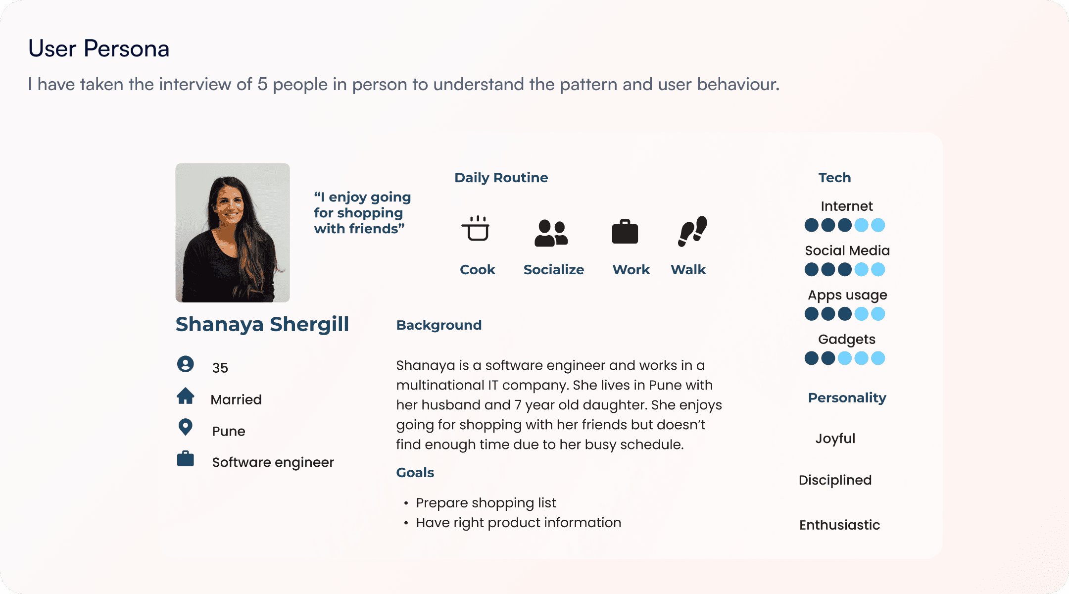
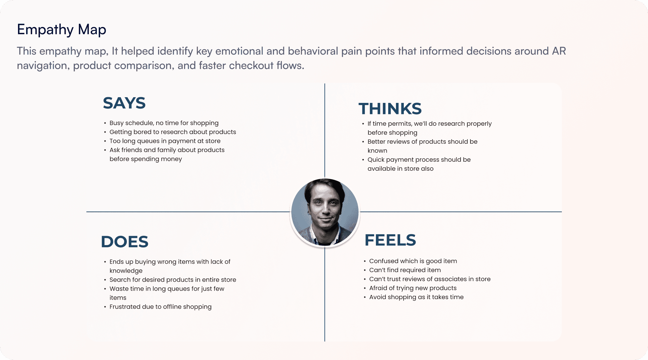
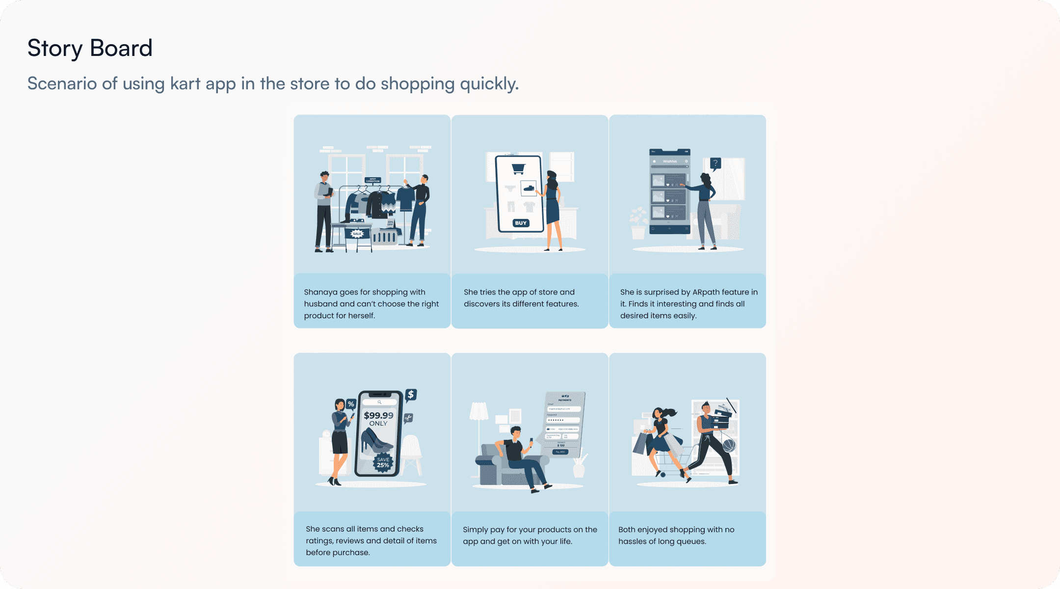
I ran a short survey with 24 respondents and conducted 5 contextual interviews. Based on the research data, I developed detailed user personas and empathy maps to deeply understand user needs and motivations. Using these personas, I created storyboards to visualize typical shopping scenarios. I then performed card sorting exercises to organize content logically and designed the app’s information architecture to ensure intuitive navigation and a seamless user experience.
Design Decisions
A 2-week timeline forced me to be explicit about what I was and wasn't designing. Here are the three decisions I made deliberately — and the tensions I had to navigate.
AR as a layer, not a replacement
Option A — Full AR mode: Everything rendered through the camera at all times. More immersive, more novel.
Option B — AR on demand: AR activates only when needed (navigation, scanning). Otherwise the app behaves like a normal list.
Navigation path first, scan second
Research showed navigation loss was more painful than product confusion. So AR wayfinding (the path-to-product feature) got priority in the core flow.
Delight as opt-in, not default
Gamification elements (virtual coupons, gift collection) were designed as rewards that appear naturally along the shopping path, never interrupting the primary task.
Key Experience Improvements
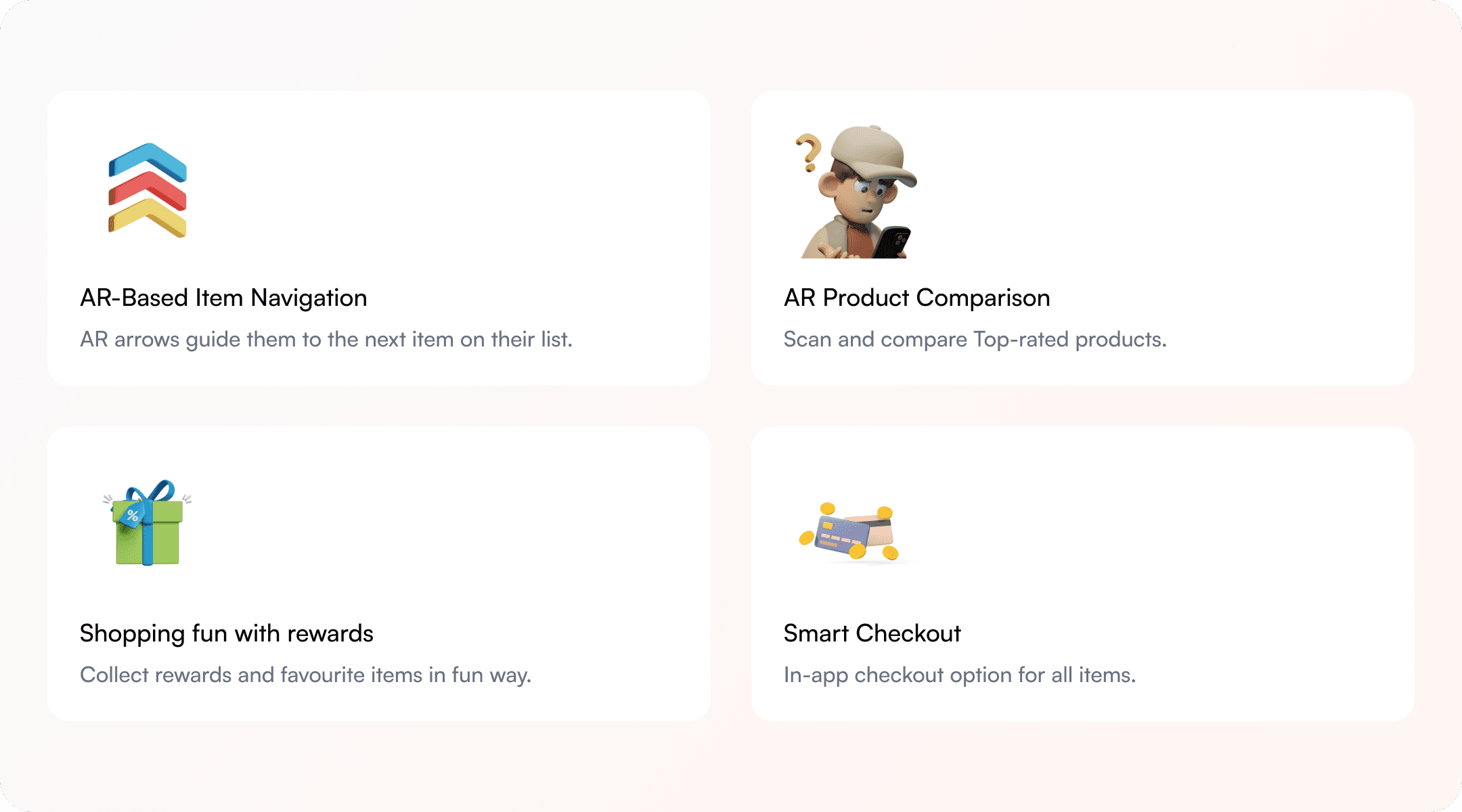
The AR path follow feature guides users directly to their desired products within the physical store.
Users can collect virtual gifts and coupons as they shop, adding a fun and rewarding layer.
Scanning products with the AR app instantly gives detailed descriptions, reviews, and can compare similar products.
According to the wishlist, it will show where upcoming products are located inside a store using favorite tags.

Sketching and Wireframing
I began with quick sketches to explore layout ideas, then created low and mid-fidelity wireframes to define structure and user flow before moving to high-fidelity designs.
FINAL DESIGNS
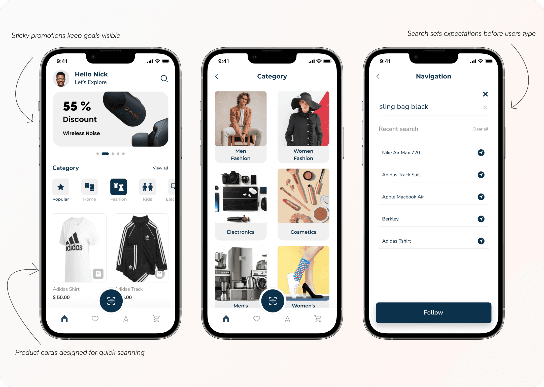
Home, Search & Product Navigation
Home Screen
Designed to quickly orient users with key promotions, popular categories, and scannable product cards to support fast decision-making.
Category Screen
Helps users narrow choices through clear visual grouping and consistent layouts.
Search & Navigation Screen
Allows users to quickly search for items, and on tapping the arrow icon, activates an AR-guided path that leads them directly to the product’s location inside the store.
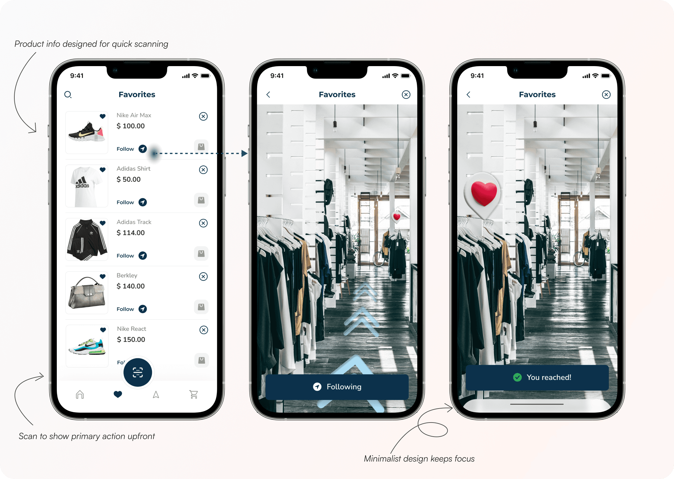
AR Wayfinding & Favorites
Favorites Screen
Displays saved products in a scannable list with essential details, allowing users to quickly select an item they want to locate in-store.
AR Navigation Screen
Activates a minimal AR-guided path that leads users directly to the selected product while keeping focus on the physical environment.
Destination Confirmation Screen
Provides clear visual feedback once the user reaches the product location, giving reassurance and closing the navigation task.
Cart, Order & Confirmation
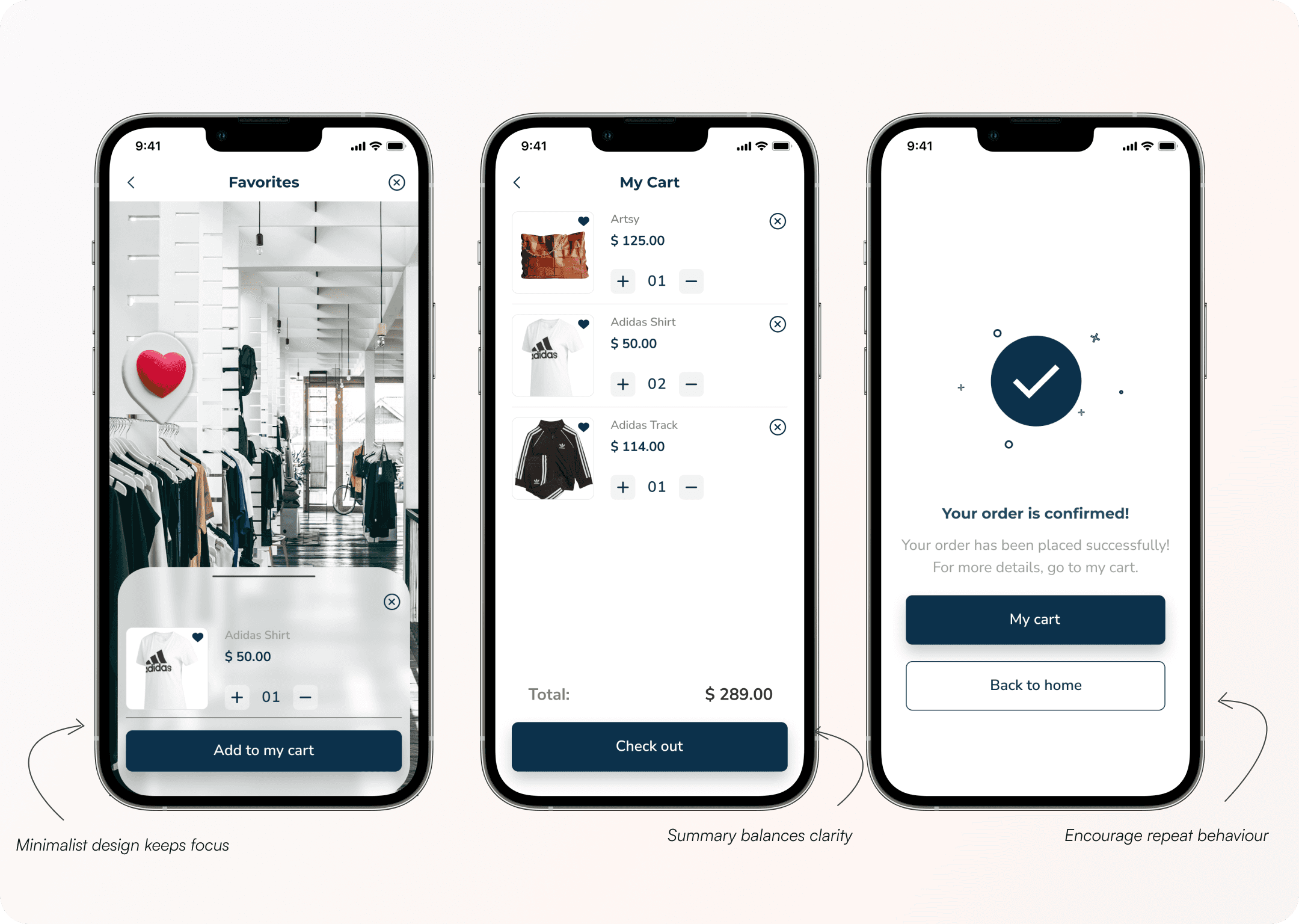
In-Store Add to Cart Screen
Allows users to add a product to their cart directly from the AR view, reducing friction between discovery and purchase.
My Cart Screen
Presents a clear, editable summary of selected items with prices and quantities, helping users review and checkout quickly.
Order Confirmation Screen
Confirms successful purchase with clear feedback and next actions, reinforcing trust and encouraging repeat usage.
Scan, Pay & Checkout
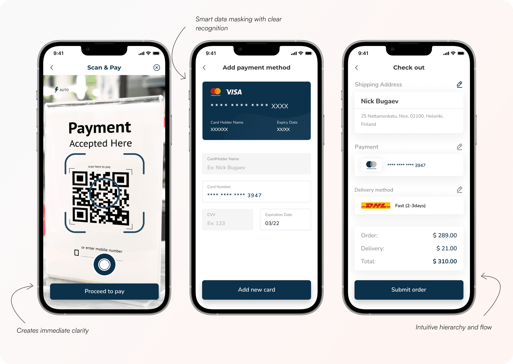
Scan & Pay Screen
Enables users to instantly initiate payment by scanning a QR code in-store, reducing checkout queues and creating immediate clarity.
Add Payment Method Screen
Allows users to securely add or select a card with smart data masking, balancing trust, recognition, and speed.
Checkout Screen
Summarizes address and payment details in a clear hierarchy, helping users confidently complete the purchase with minimal effort.
Reflections & Learning
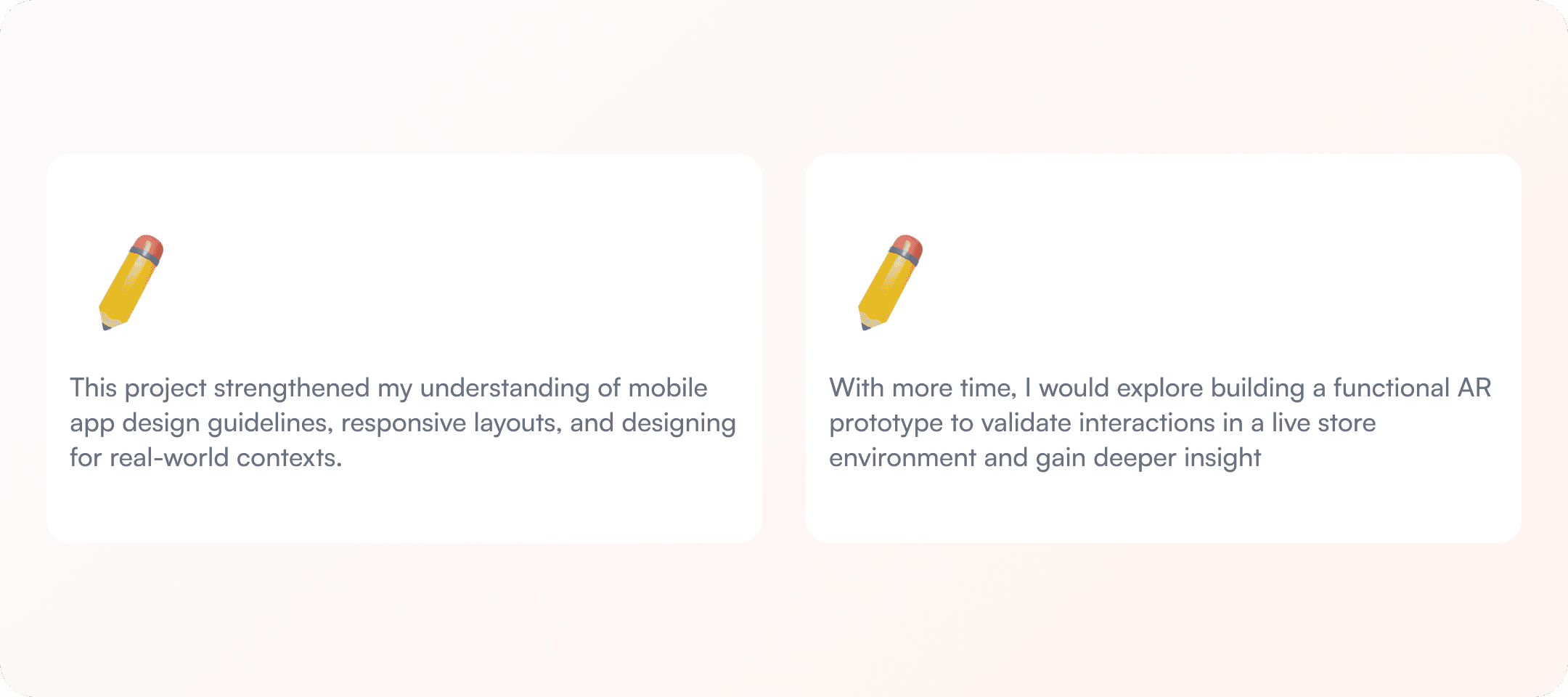
This project helped me better understand how differently users behave in physical environments compared to digital-only experiences.
What worked, what I'd do differently
Test with real shoppers in a real store. The lighting conditions, cart handling, and physical movement would change many of my assumptions about what's readable.
The gamification layer (coupons, virtual gifts) feels bolted on rather than native to the experience.